Project #5: Digital Self-Portrait

" IB, Do You Mind? "
Medium: Digital Painting/Illustration
Size: 36 in. x 36 in.
November 29, 2017
Exhibition Text
Karen Armenta
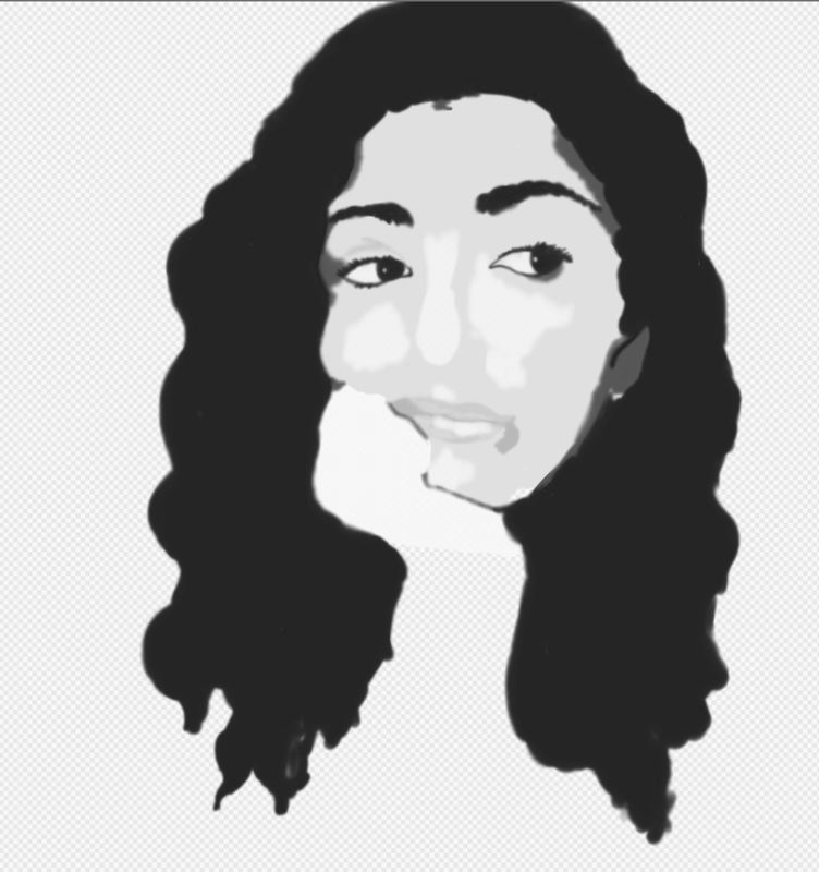
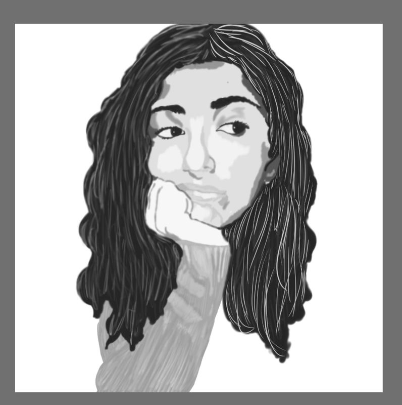
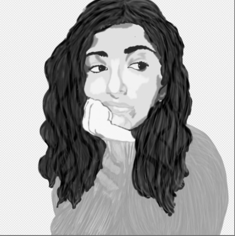
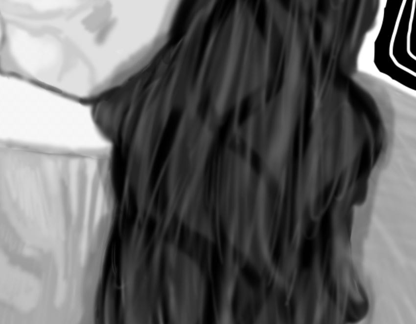
IB, Do You Mind? , 2017
Digital Painting/Illustration
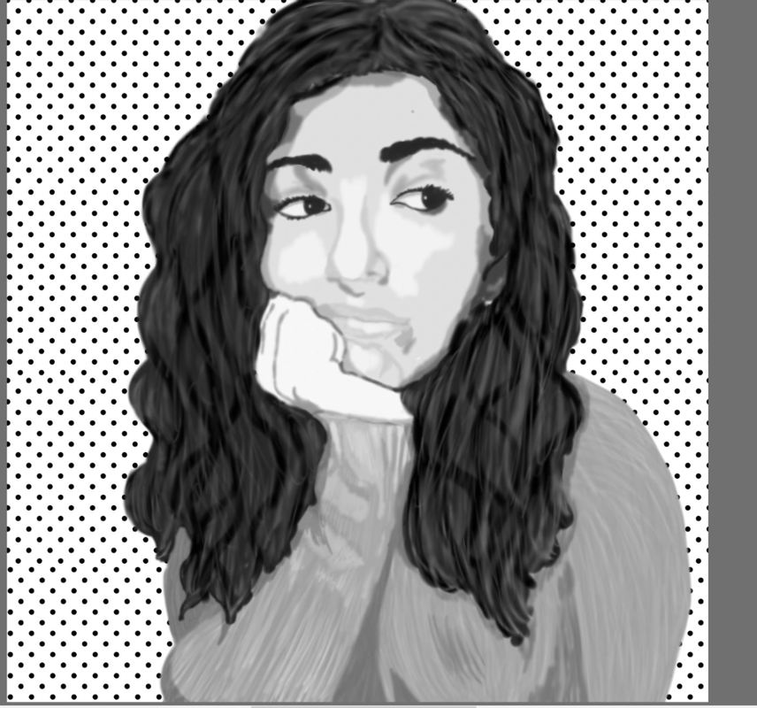
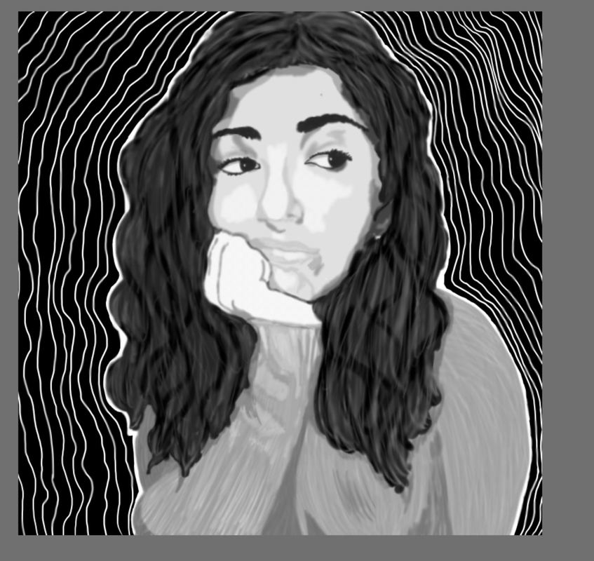
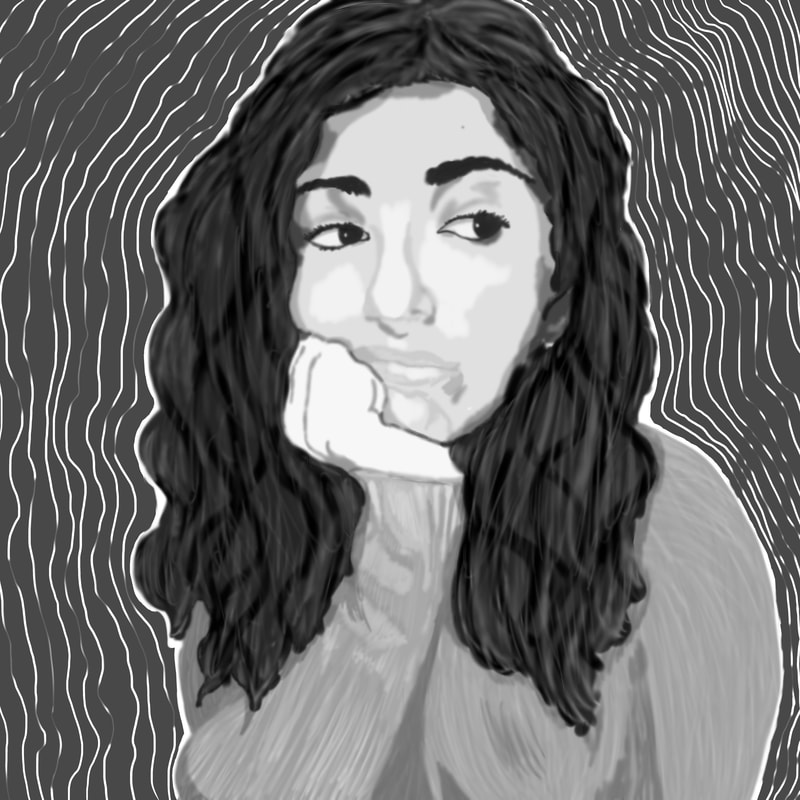
Inspired by Judith Carducci and Chuck Close, the simultaneous movements of lines in the background, sweater, and hair connect to stressful vibes in life currently and my reaction to it: unamused. Reality and pressure of getting a full IB diploma interfere with my social, personal, and school life. I lack motivation to please IB and want to please myself with work I want to make, and this final piece illustrates my constant pose when I am annoyed.
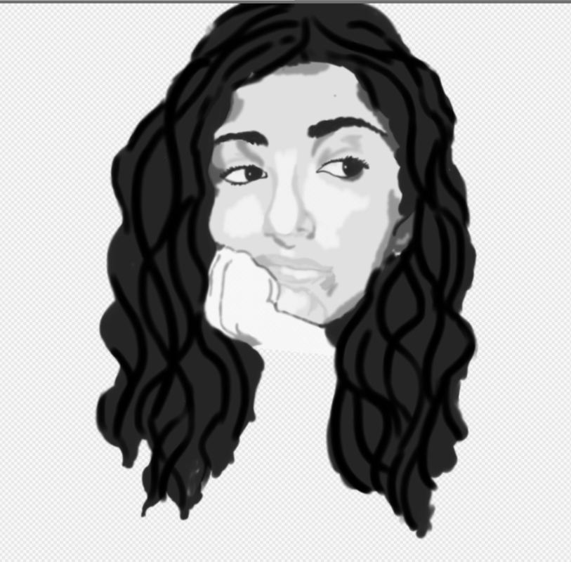
IB, Do You Mind? , 2017
Digital Painting/Illustration
Inspired by Judith Carducci and Chuck Close, the simultaneous movements of lines in the background, sweater, and hair connect to stressful vibes in life currently and my reaction to it: unamused. Reality and pressure of getting a full IB diploma interfere with my social, personal, and school life. I lack motivation to please IB and want to please myself with work I want to make, and this final piece illustrates my constant pose when I am annoyed.
Artistic Inspiration
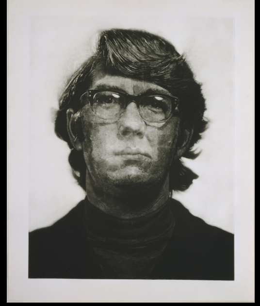
Keith/Mezzotint by Chuck Close (1972)
|
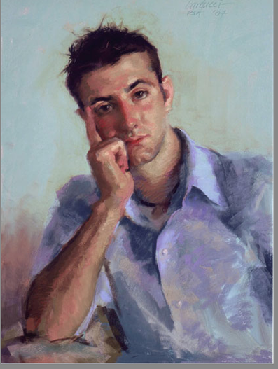
Nicholas J. Panno III by Judith Carducci
|
|
Close, Chuck. “Chuck Close. Keith/Mezzotint. 1972 | MoMA.” The Museum of Modern Art, www.moma.org/collection/works/66282.
|
“Nicholas J. Panno III.” Artist Judith Carducci Pastel Portraiture, www.judithcarducci.com/adult_portraits/nick.html.
|
Inspired by my constant struggles to keep up with my IB work, I wanted to focus on my state of mind because of IB through a self-portrait. American artists Chuck Close and Judith Carducci both significantly influenced the way my portrait would turn out to be. Judith Carducci focuses primarily on portraiture and fiddles with the concepts such as space, pose and color. Close favored black and white, which is something that exemplifies the timeless feeling of the painting and removes the prejudice of race and culture, all to set focus on the appearance of the person and the technique and precision of the painting. Contrary to Close, Carducci favored dream-like textures incorporated into realism in a portrait, all while creating soft palettes for skin tones and colors.
I was inspired to paint a digital piece in black and white to stay consistent with my preference in mediums and to be similar to my favorite artist, Chuck Close and be as precise is he. The challenge for me would be the precision in the piece as I get scared to go out of my comfort since, since I also incorporate a lot of abstraction in my works. Carducci inspired me to mess around with the concept of self-expression through my expressions in my self-portraits and emphasize my personal meaning through work meant for others. In this case, my work for IB will be a personal connection for myself and would be ironic in the sense that in the end, my work will be evaluated by IB, knowing that my piece was meant to be personal for me, and may not be interpreted the same.
|
|
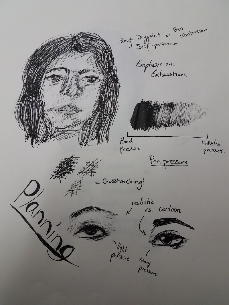
Planning
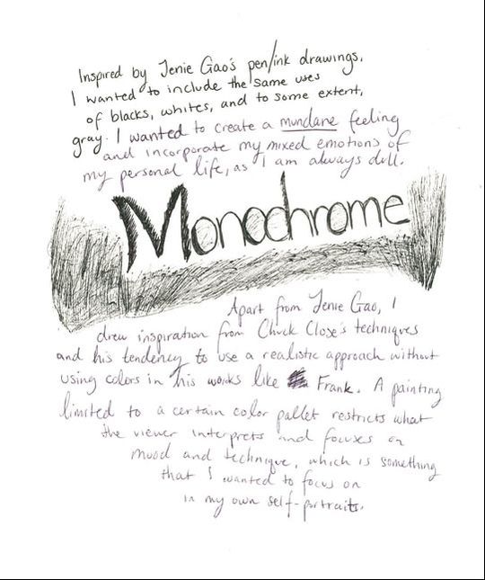
My fascination with pen ink and using pens to sketch and draw made me want to make monochromatic works centering the use of gradients of value. Black and white and a gray scale is what I wanted to use, as it portrays mundane and also creates boring, stagnant, and dreary emotions. With that in mind, I thought about making self-portraits through dry points to focus on the emotion through texture and ink, but I also thought about another digital painting to stay consistent with my mediums for senior year.
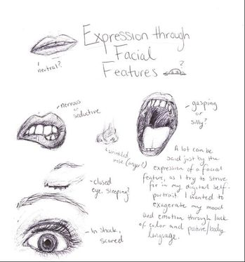
I practiced planning out my sketches with a basic rough sketch of my face, a simple headshot, to focus my first planning sketch around. I played with the gradients of the pen I was using by fixing the pen pressure as I made a gradient scale. I practiced crosshatching, as I was deciding on whether to scratch into the plate or use stippling to add details to my face. I then practiced with the designs of my eyes, as I wanted to get a feel of drawing emphasis to emotions through facial features. Eyes are huge indications to how a person is feeling, and I wanted to center this piece around weariness.
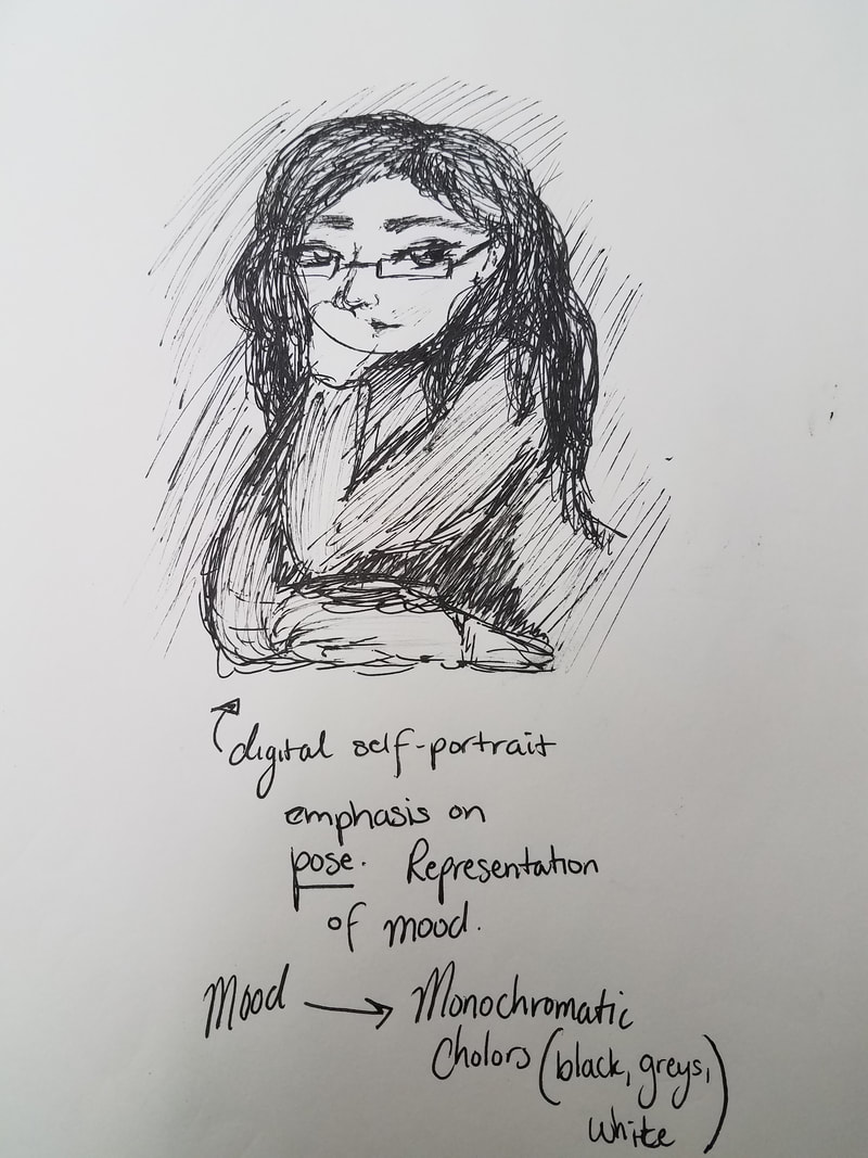
My next sketch is a sketch of me posed in a consistent pose I normally take in person. I always tend to put my hand to my cheek and look disinterested and tired. Inspired by Chuck Close and his style of using gradients as a color palette and his consistent use of portraits helped me come up with this sketch idea. I wanted to use this as a digital piece to manipulate the overall look into feeling like a blur and fit more of my artistic style. I felt attached to this idea as it contrasted how I really am, even though it is what I consistently do as a person and the little things can say a lot about a person.
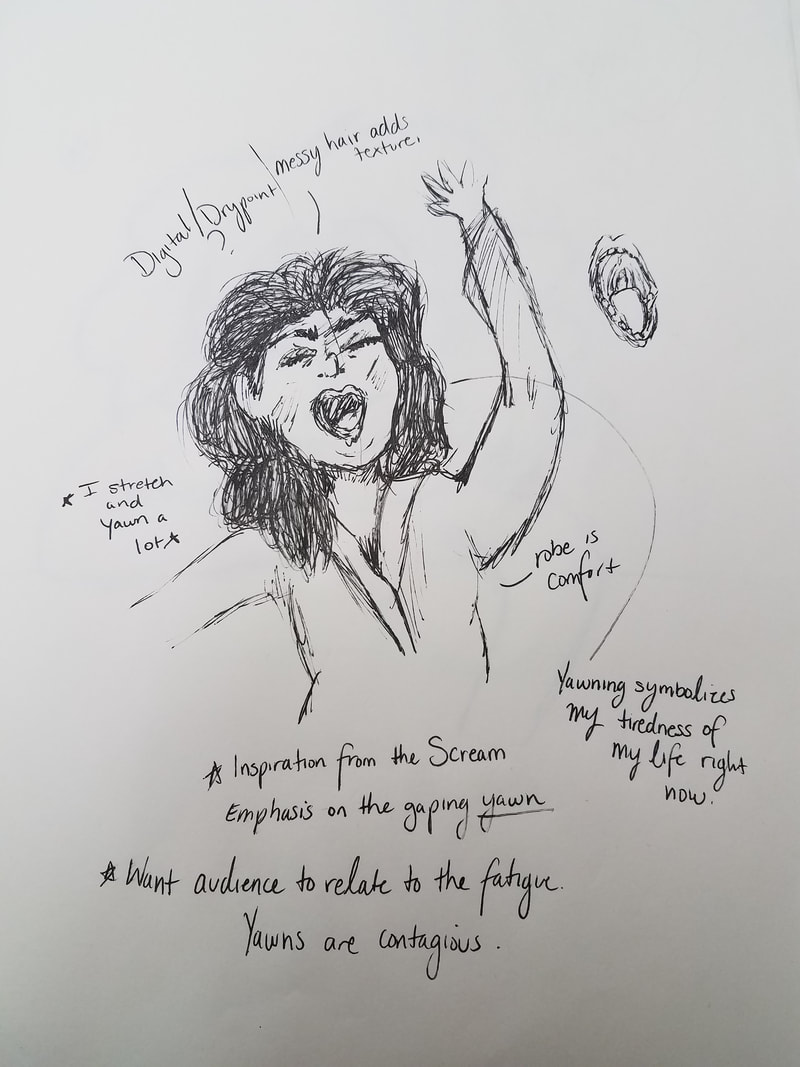
My last sketch was focused around being tired. I emphasized yawning, as yawning is contagious and the necessity of sleep is what everyone shares. Inspired by Scream, I would exaggerate the yawn by making the mouth the biggest feature on my face. Again, this sketch would be done in ink and in dry point to keep the idea for rough textures and black and white consistent.
I practiced planning out my sketches with a basic rough sketch of my face, a simple headshot, to focus my first planning sketch around. I played with the gradients of the pen I was using by fixing the pen pressure as I made a gradient scale. I practiced crosshatching, as I was deciding on whether to scratch into the plate or use stippling to add details to my face. I then practiced with the designs of my eyes, as I wanted to get a feel of drawing emphasis to emotions through facial features. Eyes are huge indications to how a person is feeling, and I wanted to center this piece around weariness.
My next sketch is a sketch of me posed in a consistent pose I normally take in person. I always tend to put my hand to my cheek and look disinterested and tired. Inspired by Chuck Close and his style of using gradients as a color palette and his consistent use of portraits helped me come up with this sketch idea. I wanted to use this as a digital piece to manipulate the overall look into feeling like a blur and fit more of my artistic style. I felt attached to this idea as it contrasted how I really am, even though it is what I consistently do as a person and the little things can say a lot about a person.
My last sketch was focused around being tired. I emphasized yawning, as yawning is contagious and the necessity of sleep is what everyone shares. Inspired by Scream, I would exaggerate the yawn by making the mouth the biggest feature on my face. Again, this sketch would be done in ink and in dry point to keep the idea for rough textures and black and white consistent.
Process
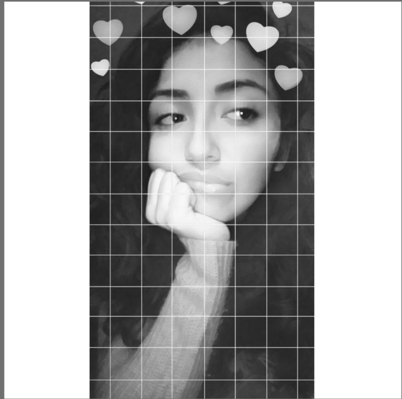
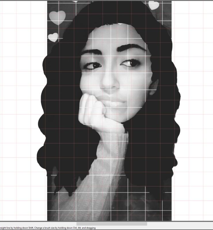
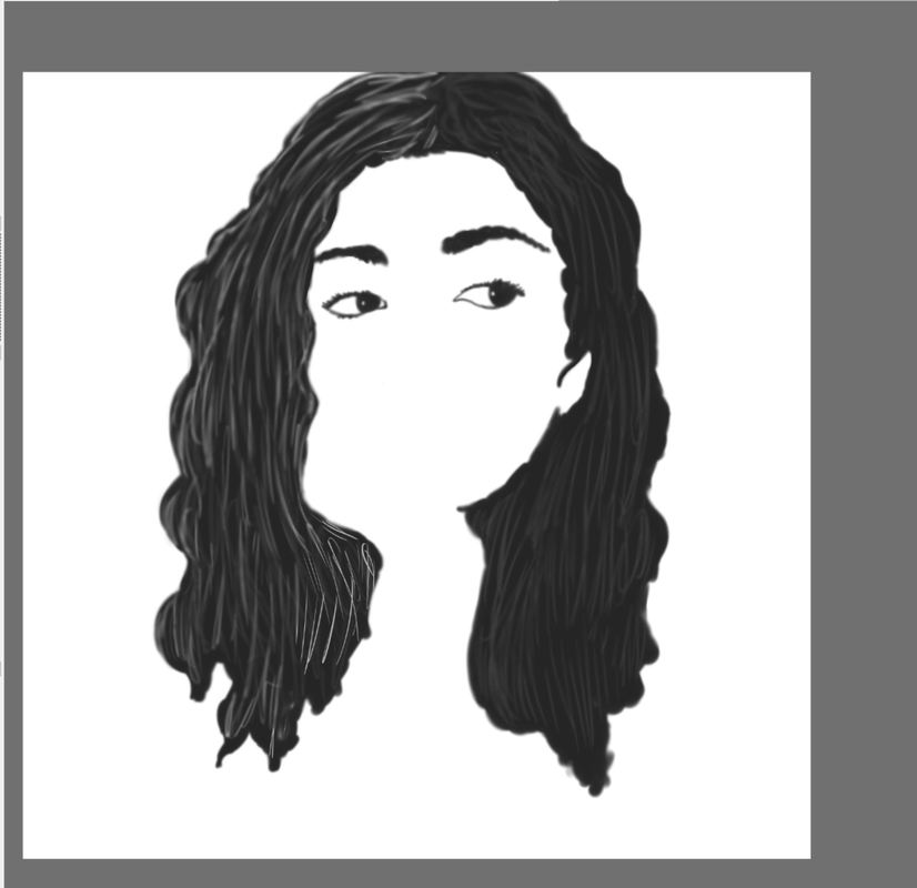
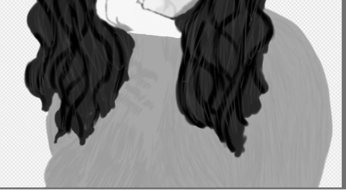
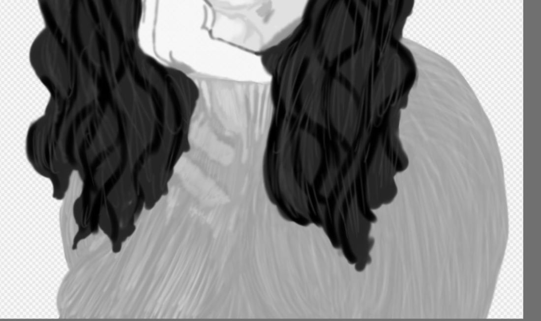
I first started off by choosing an image I had been meaning to illustrate that looked very much like my sketch that I had drawn beforehand. I set the image to be only in black and white, losing its color and only keeping the values and shades of black and white. I then figured out how to put a grid on my image to know where everything goes for when I start painting on my face. After setting up the guide lines, I began painting on the blacks, making sure every new color and parts of my face got its own layer. From there, I proceeded with my hair, eyebrows, and eyes, as they were all black. I used the watercolor brush because I felt that it was an easier way of painting everything on.
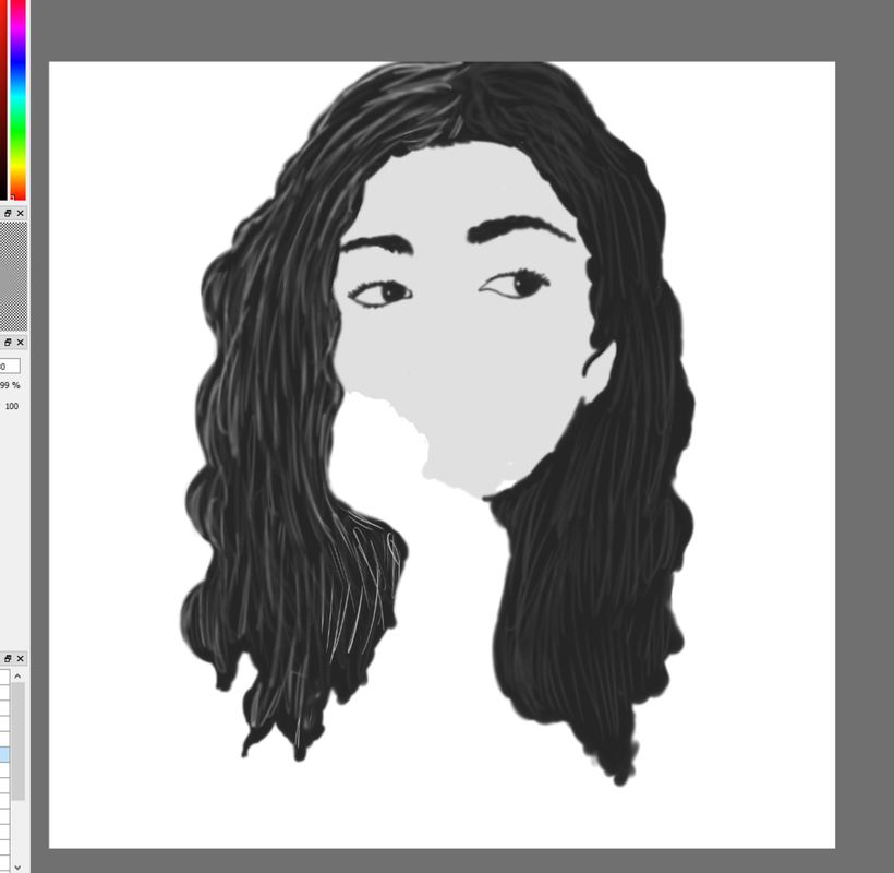
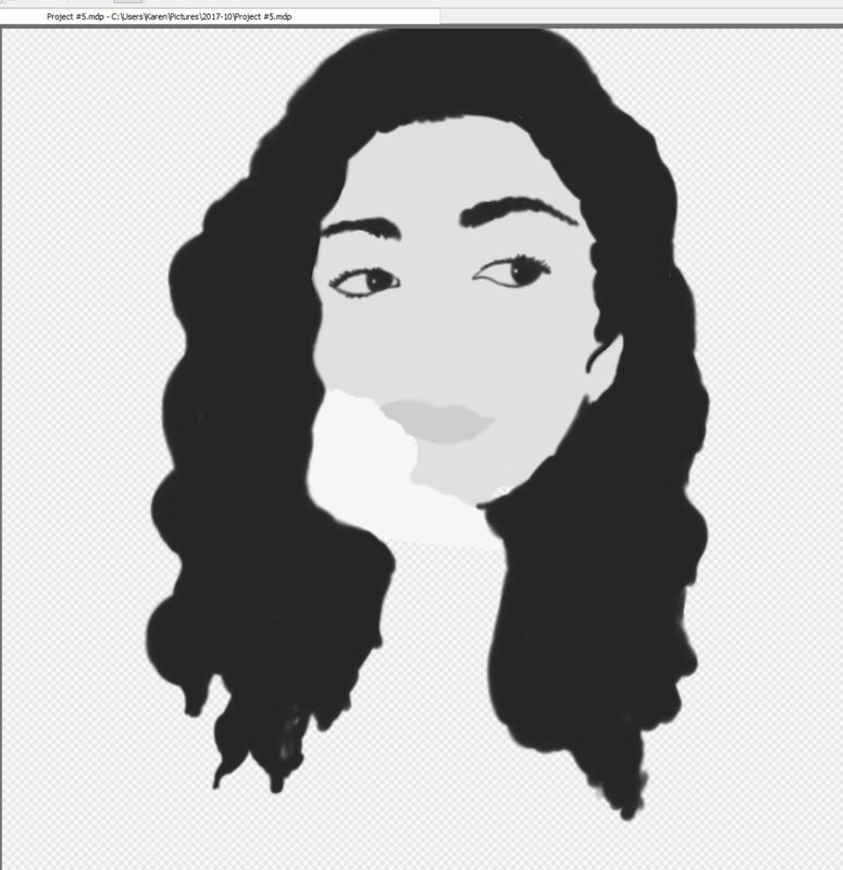
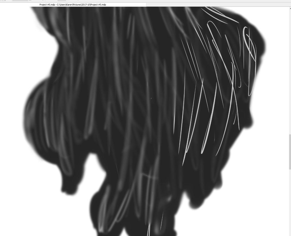
From the darkest shade, I moved on to the lighter shades of gray for my face and eventually added the shading and highlights to give my facial features more depth and form, which is key when illustrating in monochromatic values. I was aiming for partial realism, as I favored that style in digital works and used the guidelines to make it easier for myself in the process. After finalizing the different tones of gray on my face, I continued with the rest of the volume of my hair by adding gradients of black onto the already black hair. I used lighter grays and white to define the form of my hair. Moving towards the tips of my hair, I began the process of recreating my sweatshirt with grays and whites through lines that were close together.
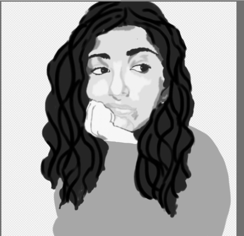
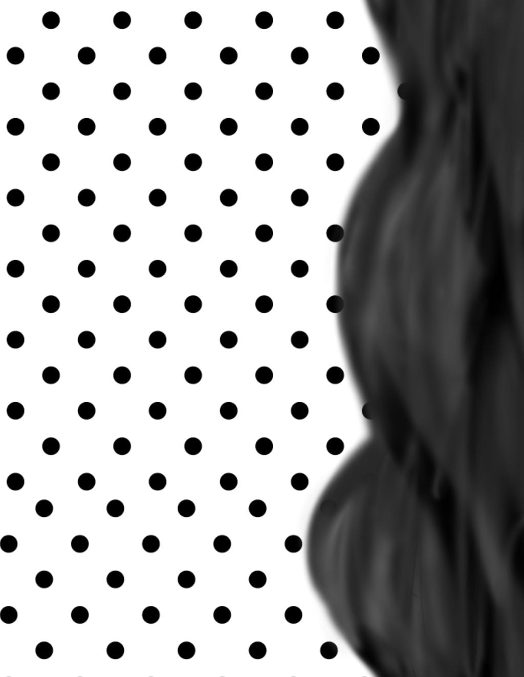
Once finishing my sweatshirt, I began my background. I used a dotted background to to emulate Pop Art but then changed it to a lined background. I made white lines on a black background and changed the values and contrast of the background color to better bring out the emphasis on the focus on my portrait. From there, I made the background lighter, more of like a dark grey and obscured the lines to look uneven and 'noisy' to symbolize how the outside world of the reality I live in sends waves of annoyances.
From the darkest shade, I moved on to the lighter shades of gray for my face and eventually added the shading and highlights to give my facial features more depth and form, which is key when illustrating in monochromatic values. I was aiming for partial realism, as I favored that style in digital works and used the guidelines to make it easier for myself in the process. After finalizing the different tones of gray on my face, I continued with the rest of the volume of my hair by adding gradients of black onto the already black hair. I used lighter grays and white to define the form of my hair. Moving towards the tips of my hair, I began the process of recreating my sweatshirt with grays and whites through lines that were close together.
Once finishing my sweatshirt, I began my background. I used a dotted background to to emulate Pop Art but then changed it to a lined background. I made white lines on a black background and changed the values and contrast of the background color to better bring out the emphasis on the focus on my portrait. From there, I made the background lighter, more of like a dark grey and obscured the lines to look uneven and 'noisy' to symbolize how the outside world of the reality I live in sends waves of annoyances.
Experimentation
I experimented with the way I decided to blend my facial features digitally. I messed around with the actual blending of lines and solid color to blurring the color into the second color to create the illusion of blending color. I blurred white lines and grey lines to create the illusion of highlights and strands of hair, as my hair is thick and has many lines to create texture. I wanted to illustrate that and continue going with it as a way to form the volume of my hair.
I also experimented with the background as I didn't really plan out to detail how I wanted to utilize my background. I wanted to originally incorporate some aspects of Pop Art and use the dots texture to fill in the white space of my background. I messed around with the sizes and amounts of dots that appeared and even inverted the colors where the background is black and the dots were white. Ultimately I scrapped the idea because I felt that the background was just random and didn't follow what I was trying to do, which was to go with the theme of blurring and looking fazed.
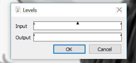
Towards my finished piece, suggestions were made to lighten the background as it blended in too much with the colors of my portrait. I navigated through the levels of the contrast and saturation and tested out how a lighter background would look instead of a darker background. The thinning of the positive space in the lines in the texture of the background were made smaller because of the changes in the contrasting in the levels of the background.
I also experimented with the background as I didn't really plan out to detail how I wanted to utilize my background. I wanted to originally incorporate some aspects of Pop Art and use the dots texture to fill in the white space of my background. I messed around with the sizes and amounts of dots that appeared and even inverted the colors where the background is black and the dots were white. Ultimately I scrapped the idea because I felt that the background was just random and didn't follow what I was trying to do, which was to go with the theme of blurring and looking fazed.
Towards my finished piece, suggestions were made to lighten the background as it blended in too much with the colors of my portrait. I navigated through the levels of the contrast and saturation and tested out how a lighter background would look instead of a darker background. The thinning of the positive space in the lines in the texture of the background were made smaller because of the changes in the contrasting in the levels of the background.
Reflection
I wasn't really proud of this piece as it does look a little rushed, but at the same time, I did it on purpose. I feel that my painting looks way too blurred and loses the attention in the face because of how blurred it was. It also doesn't help that the inconsistency in the background as opposed to the actual portrait isn't blurred, as in my opinion, takes away from the focus and distracts the eyes of a viewer. Maybe it is because of how I'm not too fond of using just black and white, as I am also drawn to splashes of color and making things realistic. The background could have been the thing to have color in order to act as the compromise for my love of color and my want to make a black and white portrait.
Also, I feel that the illustration in my hair could have been redone to look more accurate, as I sort of relied on the abstraction of lines and its movement and size to suggest hair and strands of hair collectively. The same thing could have been applied to my sweatshirt, as I could have gone in and defined the fabric and add texture. I feel like I rushed my work all to try and meet a deadline but at the same time, this piece was meant to represent the effort to please IB in an ironic way, where they want everything done a certain way and don't give us the time to do it in a neat way.
If given more time, I would redo this project as a whole. I don't think the idea of black and white painting suits me as much as I love Close's style and take on this technique. It was hard to try to recreate Close's technique, especially when painting digitally. I probably overdid it with the blending as I used blurring to blend in tones, but even then, lack of color made me disinterested and I unintentionally tried to get done with something I wasn't really feeling. I believe that Carducci's use of human actions was well perceived in my piece, as my portrait is't static and does not simply portray myself starting dead center at a viewer, sometimes like Close's paintings of his subjects.
Connection to ACT
Identify cause and effect relationships between your inspiration and your artwork.
Both artists feature portraits of themselves in different mediums, times of their lives, and different expressions of color. I strayed away from my tendency to use color and keep my style realistic, but at the same time, use a gradient scale of value to illustrate myself i a way that steps out of my comfort zone.
What is the overall approach the author has regarding the topic of your inspiration?
Judith Carducci is an American painter who specializes in portrait paintings, and features personal connections to her subjects and her paintings, even when they are up for commission. Much like Chuck Close, she also emphasizes human expressions i her works, and although both artists rely on realism, color and techniques are significantly different yet are much alike in the sense of their realness touch.
What kind of generalizations and conclusions have you discovered about people, ideas, cultures, etc. while you researched your inspiration?
I thought that commissions were meant to be specifically for the buyer and did not give the opportunity to be given meaning from the artist, however I found that not to be true as Judith Carducci defies the stereotype and incorporates subtle things like use of color and styles to add meaning and emotional connections to her commissioned pieces.
What was the central idea or theme around your inspirational research?
My theme was human emotion and expressions and how that relates to the content of a work of art regarding culture and human struggles.
What kind of inferences did you make while reading your research?
I made the inference that American artists only made patriotic pieces but that wasn't the case. American artists did use their homeland as a way to include culture but never to promote government or political views.
Bibliography
“Judith B. Carducci, PSA, PSS — :: Artist's Statement and Biography.” Artist Judith Carducci Pastel Drawings and Paintings: Portraiture, Landscapes and Still Lifes, www.judithcarducci.com/bio.html.
Oldenbroke. “Artists in Pastel.” Judith Carducci, 1 Jan. 1970, www.artistsinpastel.com/2012/11/judith-carducci.html.
Cumming, Laura. “Impressionists in London; Monochrome: Painting in Black and White – review.” The Observer, Guardian News and Media, 5 Nov. 2017, www.theguardian.com/artanddesign/2017/nov/05/impressionists-in-london-review-tate-britain-monochrome-national-gallery-painting-in-black-and-white.
