Digital Manipulation

"Mi Preferida Mexico"
Medium: Digitally Manipulated Block Print on Photoshop
Size: 3 ft. by 8 ft.
October 4, 2017
Exhibition Text
Karen Armenta
Mi Preferdia Mexico, 2017
Block Print and Digital Manipulation
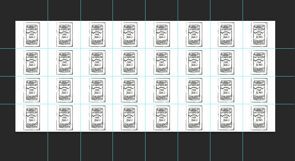
This piece, inspired by Andy Warhol’s 32 Campbell’s Soup Cans, is meant to represent the obsession of myself through my heritage. As a young Hispanic women, my cultural identity makes up a lot of who I am and as a citizen of the United States, the constant reminder of my culture is included in my daily life. Being Mexican is a huge part of who I am, even if there are times where I feel like I live a double life because I was born a United States citizen.
Mi Preferdia Mexico, 2017
Block Print and Digital Manipulation
This piece, inspired by Andy Warhol’s 32 Campbell’s Soup Cans, is meant to represent the obsession of myself through my heritage. As a young Hispanic women, my cultural identity makes up a lot of who I am and as a citizen of the United States, the constant reminder of my culture is included in my daily life. Being Mexican is a huge part of who I am, even if there are times where I feel like I live a double life because I was born a United States citizen.
Artistic Inspiration
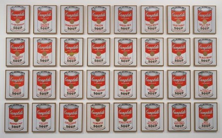
[32] Campbell's Soup Cans by Andy Warhol
“#87: MOMA.” 1000 Things to do New York, 18 July 2013, www.1000thingsnyc.com/moma/.
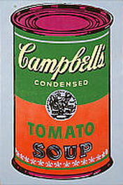
Campbell's Soup by Andy Warhol, 1965
Acrylic on canvas
36 × 24 in.
Campbell's Soup | Milwaukee Art Museum, collection.mam.org/details.php?id=11618.
|
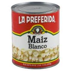
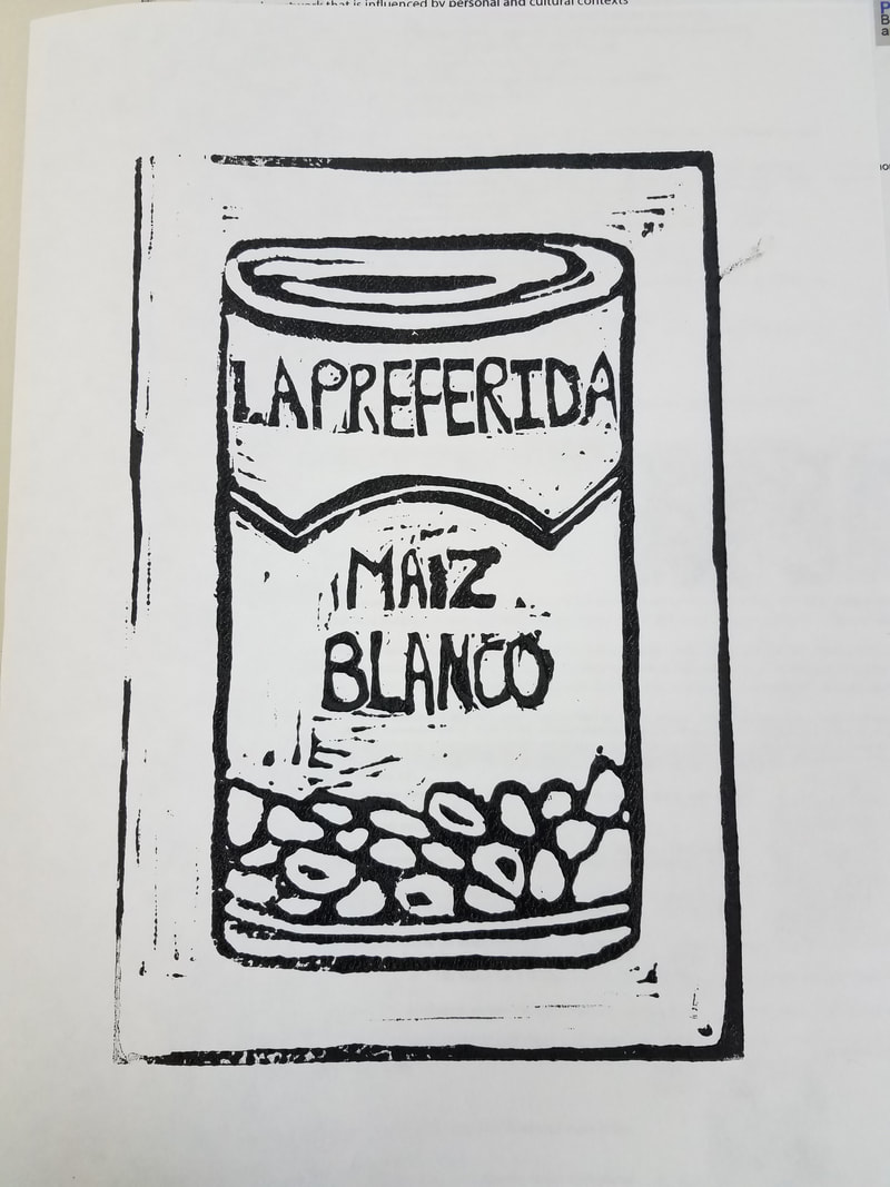
Maiz Blanco/ White Hominy
https://www.google.com/url?sa=i&rct=j&q=&esrc=s&source=images&cd=&ved=0ahUKEwjdzpr32eTWAhWJOCYKHW7JDBgQjhwIBQ&url=https%3A%2F%2Fwww.meijer.com%2Fproduct%2Fgrocery%2Finternational%2Fhispanic%2Fla-preferida-hominy-white-29-oz%2Ft1%2Ft1-865%2Ft2%2Ft2-9981%2Ft3%2Ft3-247%2F7152402089.uts&psig=AOvVaw1asjfesX_SYoeluXMvQRqn&ust=1507678379983722
|
Andy Warhol's Campbell Soup Cans has been an iconic piece in art history and one of the many artworks that I list off right away when thinking about Pop Art. I was inspired by Warhol's use of repetition in Campbell Soup Cans and wanted to utilize the same element to emphasize my own personal idea and connection to my idea with the content of the piece and its meaning. Warhol introduced society to consumerism unintentionally because of the content of his piece and I wanted to do the polar opposite of his intentions by making the object that is being repeated intentional and meaningful to others including myself. The object I chose does have relevance to other people in my cultural community much like how the Campbell's soup is a household item in the stereotypical American household. The idea of consumerism inspired me to promote my own culture through repetition almost like an advertisement.
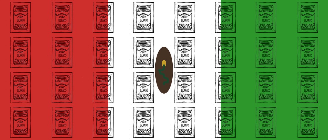
Pop Art was the style that influenced my choice in style to my work and the product I chose to use as an object was purposefully chosen because of its relevance to my heritage and the striking similarity to that of a Campbell's soup can. I am hoping for people to mistake the product to that of a soup can instead of what it really is to demonstrate how we have been brainwashed to instinctively recognize things as Americanized items. My identity is integrated in my piece through the visual representation and symbolism of the Mexican flag.

|
|
Planning
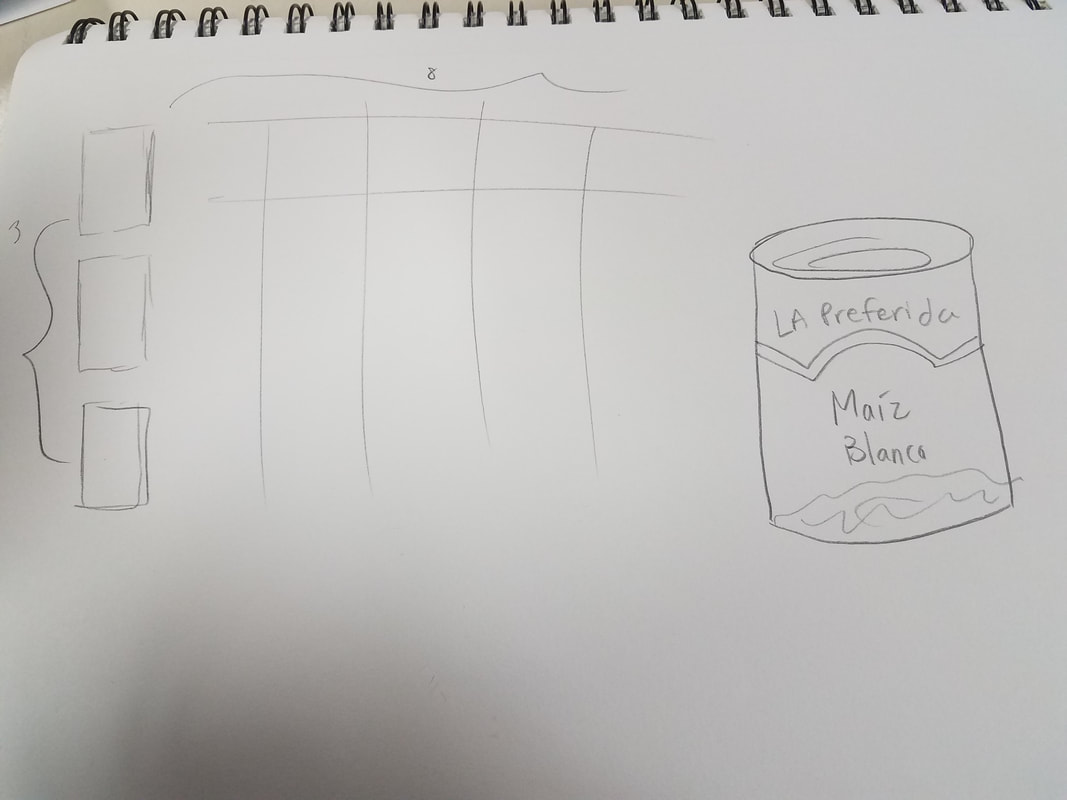
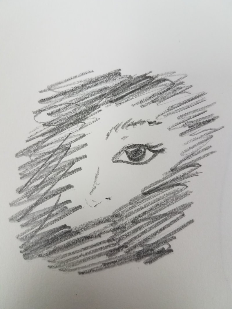
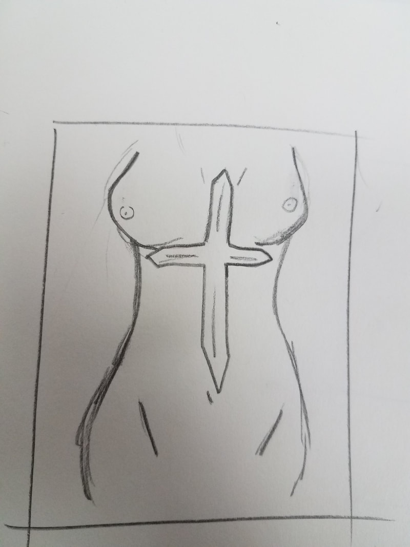
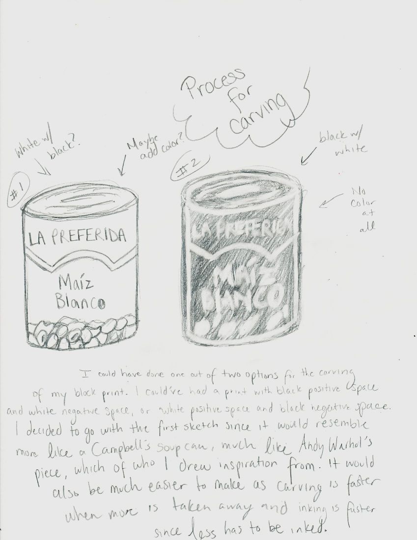
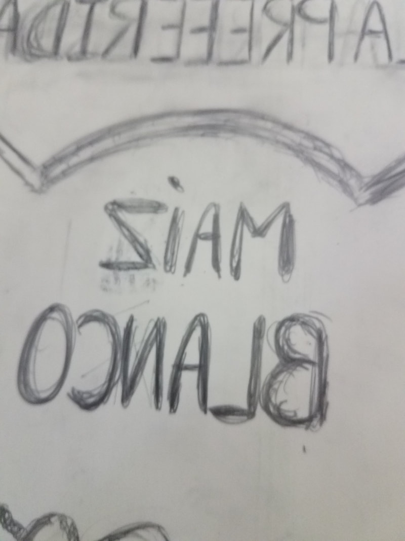
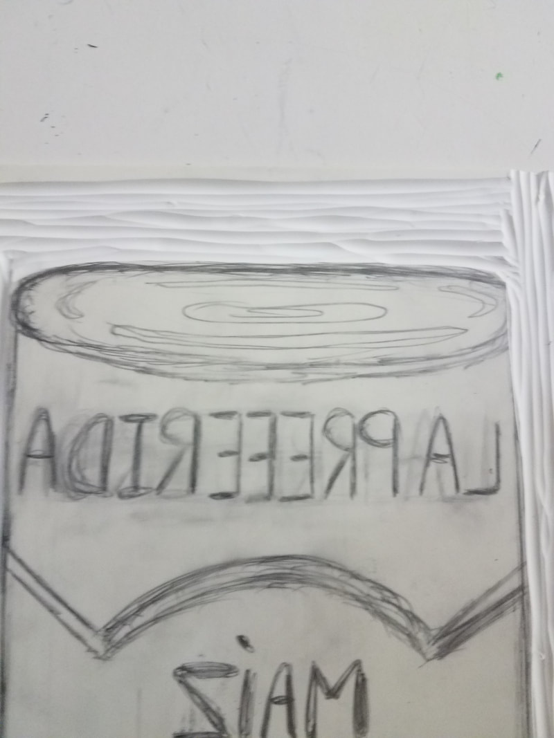
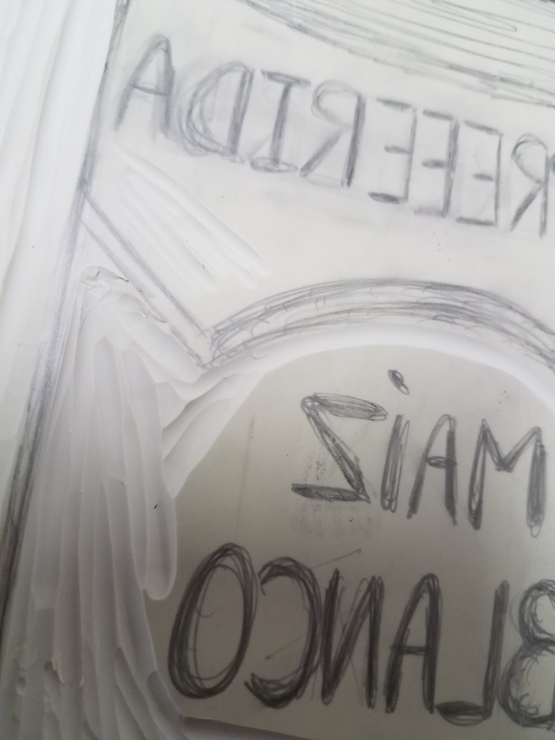
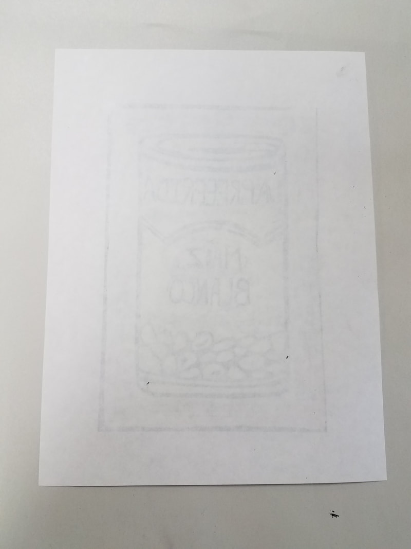
I knew right away that I wanted to make a block print styled artwork and I dedicated most of my designs to block print styles. I wanted to stay within the idea of my obsession with myself and went about demonstrating it through symbolism. The first sketch is an array-like poster that repeats the can of hominy. This was meant to represent my cultural identity through the obsession of an object. The hominy can means a lot to me in regards to my household and this would be more of a personal artwork and limited shared experience rather than connecting to all of my audience. The next sketch was a print idea to use minimal application of negative space to create a face hidden among black positive space. This was sketched out to symbolize my obsession with myself through my isolation and tendency to keep to myself. The eyes are windows to the soul and I wanted to emphasize that only by showing eyes peeking out through a head full of hair. My last sketch was meant to be a block print to highlight my obsession with the human body and its taboo with my religion, coming from a Hispanic background. This was going to be a very thin lined carving piece to utilize technique and style. The thin lines would symbolize my weak connection with my religion and the fine line that separates the idea of nudity and the idea of preserving the human body because of its sacredness.
Process
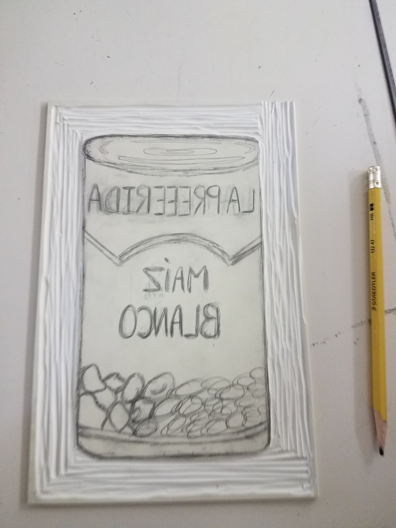
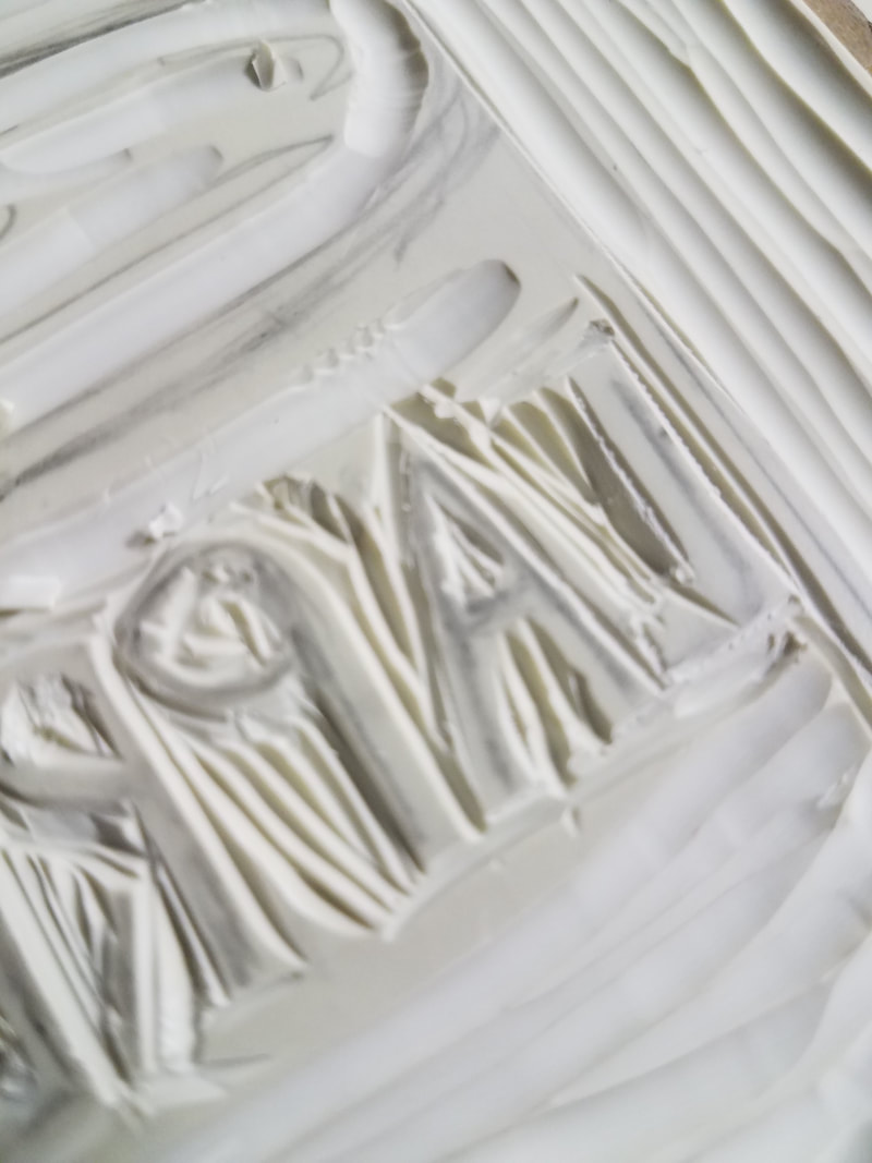
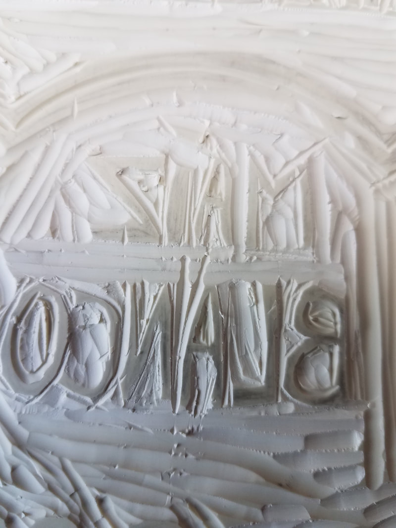
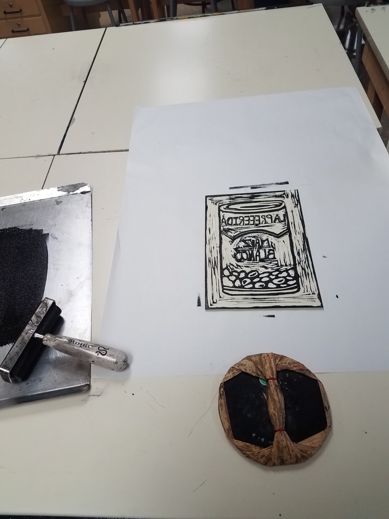
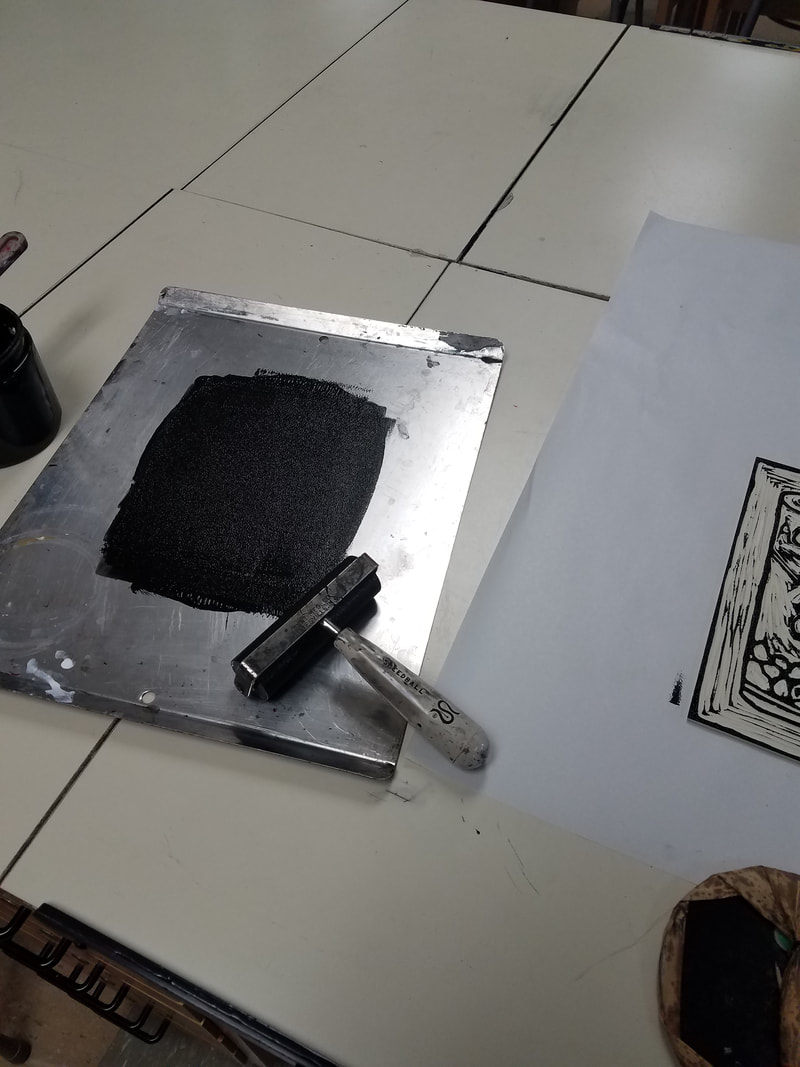
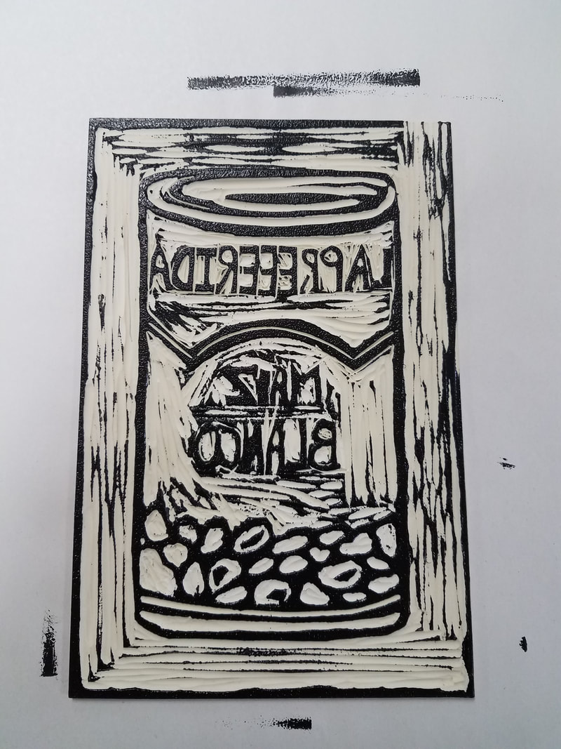
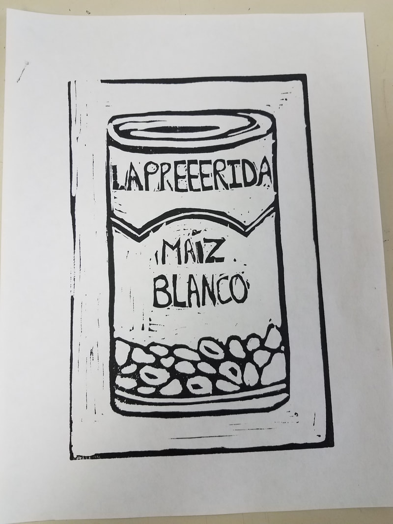
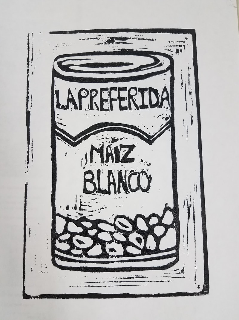
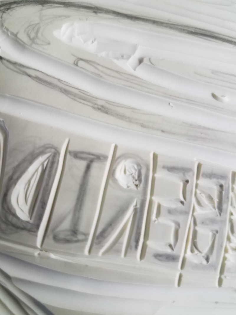
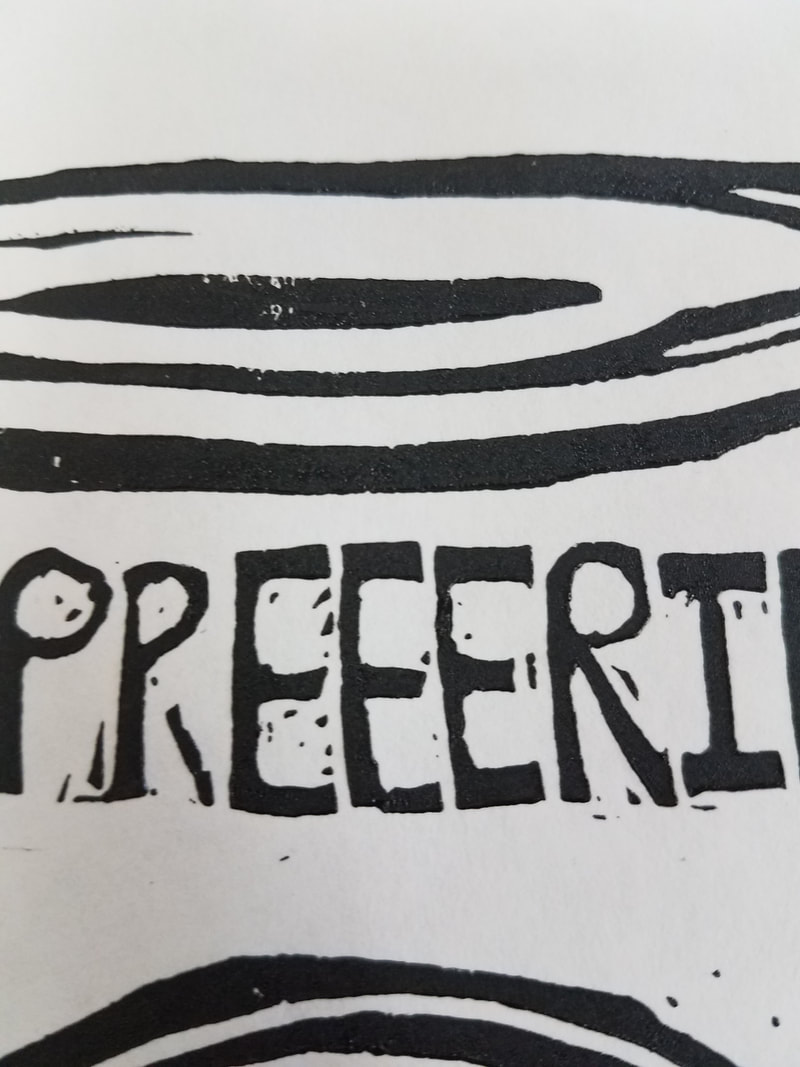
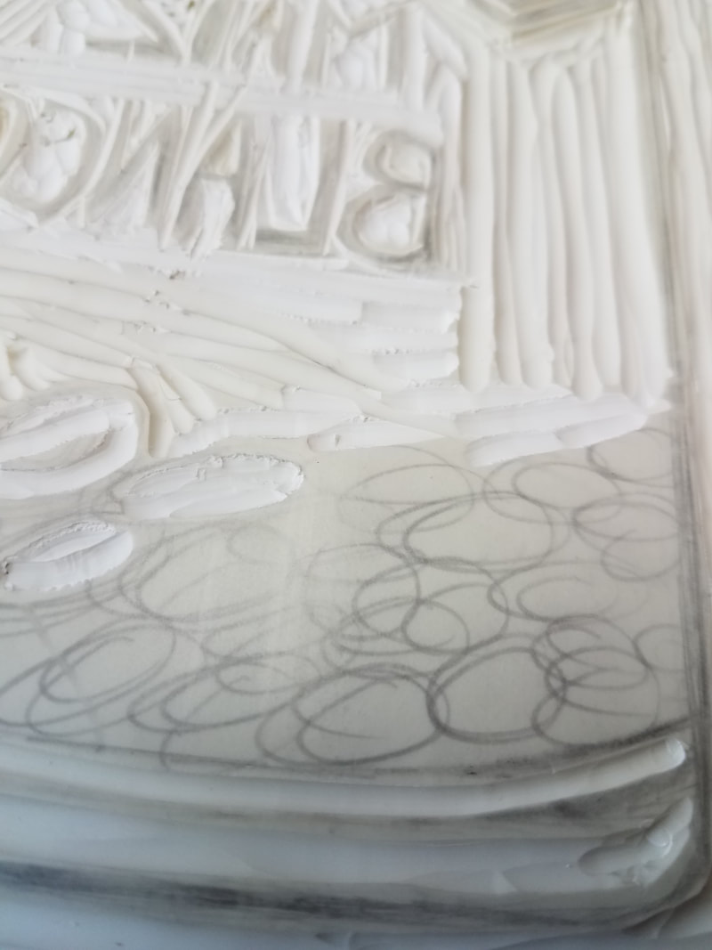
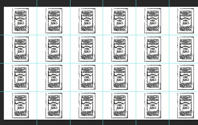
I began the process by transferring the drawing of the hominy can to a block print. I carved out what I wanted to be white and left in what I wanted to leave a mark on the paper with ink. I used a thin blade to carve out border around the areas that I wanted to transfer the ink when I put the paper over it. The thin carving was meant to prevent me from carving across the parts that were intended to be black. For large areas of white, I carved with a wider carving tool so that I could make the carving process go a lot faster and smoother. I took the longest carving out the letters and made sure they were carved out backwards since it would be printed backwards if I carved them out the way one would normally write them out. Once having everything carved out, from the can to the individual pieces of hominy. I printed out a total of 4 block prints and chose the best, clean one to use to scan so that I could begin the manipulation part of it through Photoshop.
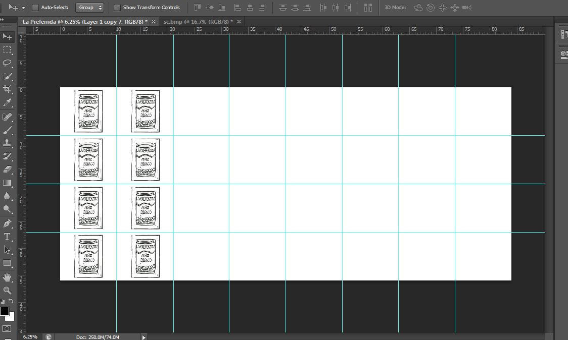
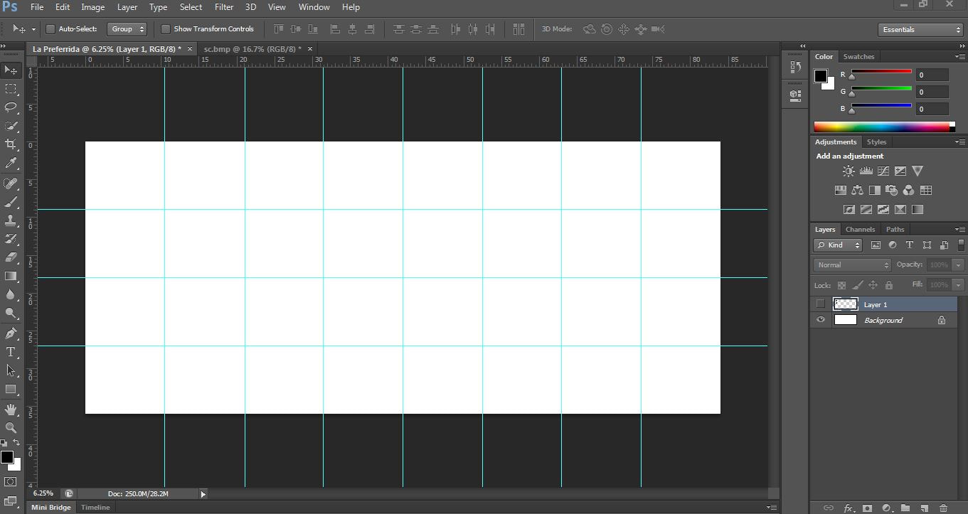
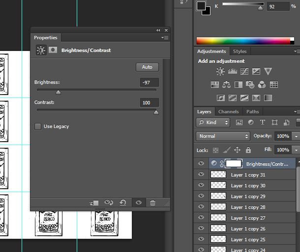
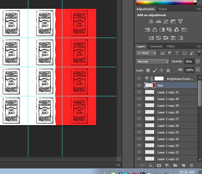
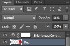
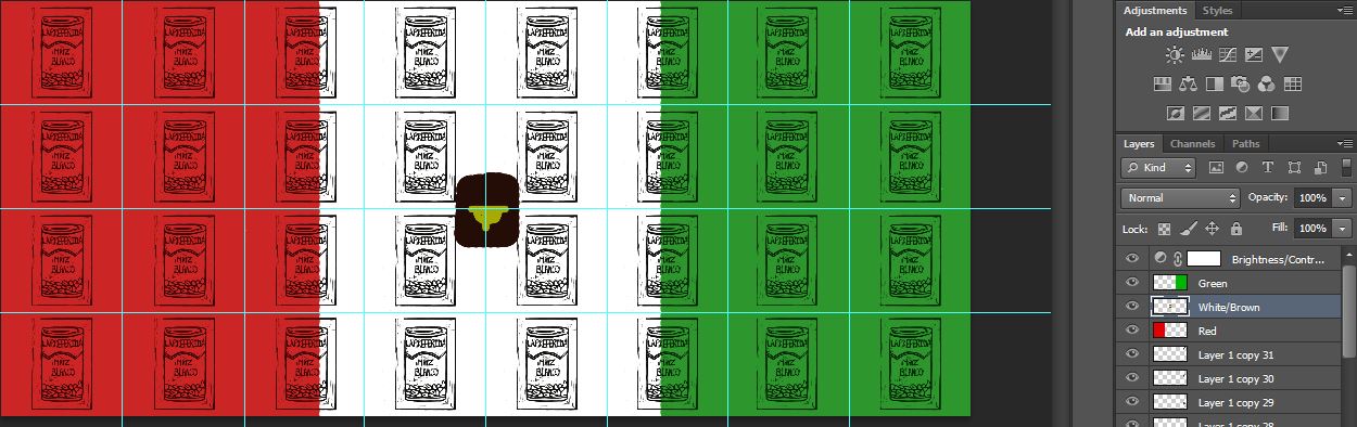
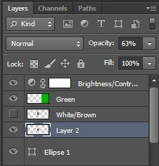
After scanning my chosen block print, I rotated it a little because it wasn't perfectly centered when I printed the block print. I needed it straight to make it easier to align when I made multiple copies of them when putting them in an array, similar to that of Warhol's Campbell's Soup Cans. Once having altered my image, I set up a new image and set up the proportions of the image size and turned on the grid option to guide me through the array making process. After finalizing all of my guidelines and ways to help my manipulation process much more easier, I began pasting the altered image of the hominy and aligning it within the guidelines I set up. Once set up, I duplicated the layer and continued to do the same thing by realigning it in another section of the guideline. Once I finished the array of cans, I adjusted the contrast so that the black would be darker and visible for when I added color to my piece. After doing that, on a separate layer on top of the other layers, I added a red layer, a green layer, and a brown layer so that each color had its individual layer to hold its own color. After applying the color to each layer, I lowered the opacity so that the array of cans could be easily seen even with the color.
After scanning my chosen block print, I rotated it a little because it wasn't perfectly centered when I printed the block print. I needed it straight to make it easier to align when I made multiple copies of them when putting them in an array, similar to that of Warhol's Campbell's Soup Cans. Once having altered my image, I set up a new image and set up the proportions of the image size and turned on the grid option to guide me through the array making process. After finalizing all of my guidelines and ways to help my manipulation process much more easier, I began pasting the altered image of the hominy and aligning it within the guidelines I set up. Once set up, I duplicated the layer and continued to do the same thing by realigning it in another section of the guideline. Once I finished the array of cans, I adjusted the contrast so that the black would be darker and visible for when I added color to my piece. After doing that, on a separate layer on top of the other layers, I added a red layer, a green layer, and a brown layer so that each color had its individual layer to hold its own color. After applying the color to each layer, I lowered the opacity so that the array of cans could be easily seen even with the color.


Experimentation
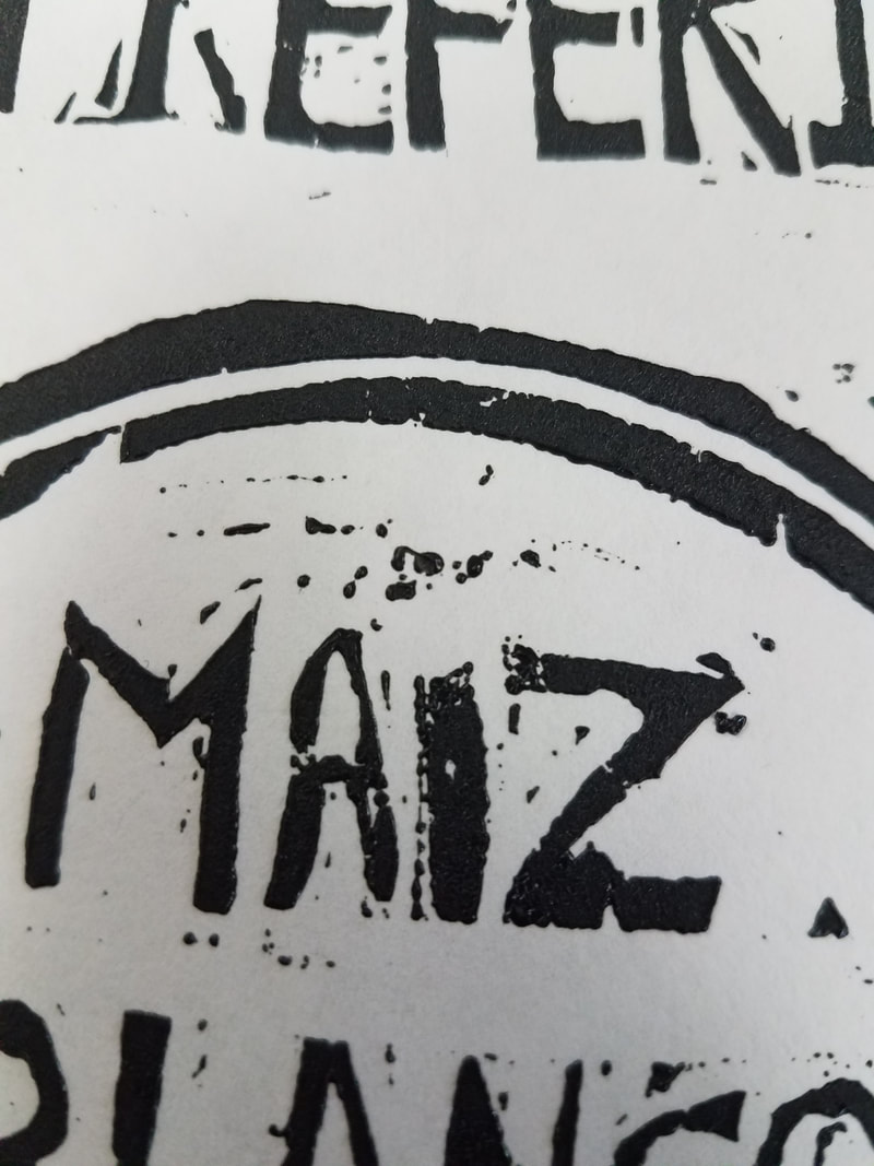
I experimented with the carving of the letters. I used straight lines to d=create a mock of what I was going to carve out to make the process easier for myself and took the most time on that. After carving and printing, I realized that I had forgotten to carve out bits of the lettering, specifically an F because it ended up looking like another E. The accent mark in the 'i' in maiz was too hard to see so I reprinted it again with more ink. This was the reason why I had to create multiple prints. In addition, I had to also experiment with how I was going to go about carving out the hominy. I tried carving out the same way I did with the letters but I found it to be more difficult and ended up carving out the hominy in a circular motion using a wider carving tool.
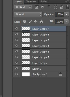
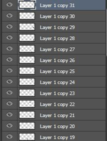
In Photoshop, I had to get more familiar with the settings as I had little experience when it came to settings and tools on Photoshop. The guidelines and ruler were my new best friends in Photoshop but I struggled to put them in. Eventually I got them to work by asking a friend who knew Photoshop more than I did. I put up the lines needed to have the same amount of cans just like Warhol's piece. There is exactly 32 layers of hominy cans arrayed in my piece. When adjusting the settings of my image, I increased the contrast levels to the most so that the value of the black ink from the print stood out the most. When adding the colors red, green, and brown, I messed around with the placement of the layers with the color. If I set the color layer behind a layer with the print, the white would show from the print and then the color which is not what I was going for. Instead, I placed the color layers above the other layers and lowered the opacity so that the print would be easily seen through the color.
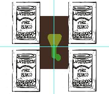
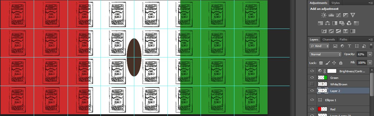
I experimented with the middle of the flag, as the Mexican flag has an eagle in the center. To illustrate it, I decided to use a block of color in the center of the array, but found the block to be distracting. This is when I messed around with the representation of the eagle. I tried to illustrate a pix-elated eagle but that didn't seem appropriate for my piece as it emphasized too much of the block state of my piece. I asked another friend for help to make circles or ovals to make an oval bird with brown an d added in the details later. I got it to work and decided to stick with the shape as it looked more pleasing to my eyes.
In Photoshop, I had to get more familiar with the settings as I had little experience when it came to settings and tools on Photoshop. The guidelines and ruler were my new best friends in Photoshop but I struggled to put them in. Eventually I got them to work by asking a friend who knew Photoshop more than I did. I put up the lines needed to have the same amount of cans just like Warhol's piece. There is exactly 32 layers of hominy cans arrayed in my piece. When adjusting the settings of my image, I increased the contrast levels to the most so that the value of the black ink from the print stood out the most. When adding the colors red, green, and brown, I messed around with the placement of the layers with the color. If I set the color layer behind a layer with the print, the white would show from the print and then the color which is not what I was going for. Instead, I placed the color layers above the other layers and lowered the opacity so that the print would be easily seen through the color.
I experimented with the middle of the flag, as the Mexican flag has an eagle in the center. To illustrate it, I decided to use a block of color in the center of the array, but found the block to be distracting. This is when I messed around with the representation of the eagle. I tried to illustrate a pix-elated eagle but that didn't seem appropriate for my piece as it emphasized too much of the block state of my piece. I asked another friend for help to make circles or ovals to make an oval bird with brown an d added in the details later. I got it to work and decided to stick with the shape as it looked more pleasing to my eyes.


Reflection
I'm not too fond of the outcome of the piece as I'm not that satisfied with the illustration of the eagle. I can't really draw eagles so I settled for something easier for my skills. I feel like I could have added more detail but due to lack of time and materials at home, I decided to settle for less. Rather than making the Mexican flag look exactly like it, I decided to make an abstraction of an eagle and make it a little pix-elated than exact.
I feel like I successfully portrayed my artistic inspiration in my artwork. I made my work have symmetrical features, both in the block print itself and the digital array as well. I also feel like I did a decent job in making the Mexican flag visible and incorporated it in a relevant way in my piece. I used repetition to my advantage to get my message of cultural identity across with the help of symbolism and the significance of the hominy can and the Mexican Flag. I even planned out the title of my piece to have meaning, as Mi Preferida Mexico translates to My Preferred Mexico, which correlates to how I purposefully decided to illustrate the Spanish translation of the can of hominy and the Mexican flag. I find humor in it as I always tend to purchase the hominy can with the Spanish translation instead of the English translation of it. This is significant as that is what I want to highlight, how even the little things matter in the identification of my culture and how it influences me in my own life. I chose the three specific colors in my piece to obviously represent the Mexican flag. I intentionally did not add color in the cans as I wanted to stray a little from Warhol's style and make it my own and make the block print aspect of my work more visible. I wanted to emulate the exact number as well because it was easier to proportionate and align the array and make it easier to make arrangements for my piece. The number created harmony and balance among the piece as everything seemed to fall into place in the array and maintained equilibrium in every way, in regards to placements, space, and colors.
I intentionally wanted to make a lot of prints but thinking it over, I decided to make a digital manipulation of the illusion of many prints made so that it corresponded with my intentional career I wanted to pursue. I also wanted to highlight my versatility with art and mediums. It was smarter to use Photoshop to manipulate an array to be similar to Warhol's works. It would be easier to also add color to my work without having to add color by hand to every print I would've made.
Connection to ACT
Identify cause and effect relationships between your inspiration and your artwork.
To make things much more easier for myself, I decided to use the exact same number of cans that Warhol used in his 32 Campbell's Soup Cans. The multicolored Campbell's Soup Can also influenced my decision to add the Mexican flag colors to my piece as it helps better accentuate my intentions in my piece.
What is the overall approach the author has regarding the topic of your inspiration?
Emphasis on repetition and its ability to force an audience to become familiar with the subject because of its modulus is what inspired me. Warhol's piece demonstrates just that and I wanted my audience to become familiar with my cultural identity and the relevance Mexican culture is in a Capitalistic country.
What kind of generalizations and conclusions have you discovered about people, ideas, cultures, etc. while you researched your inspiration?
I discovered how many people wee not familiar with the can I chose to represent in my piece. I really thought a lot of people new what hominy was. Maybe it was because I used the Spanish translation of it, but even then when I tried to explain what hominy was used to make, people were in awe.
What was the central idea or theme around your inspirational research?
The central theme around my inspiration was to commemorate the obsession of my cultural identity and its relevance to the world I live in.
What kind of inferences did you make while reading your research?
I assumed that Warhol was intentionally supporting consumerism and tried to advertise the household item, when the contrary was that he was trying to highlight the commonness of a can in a stereotypical household. Simplicity was what he was aiming for.
Bibliography
“Andy Warhol Biography.” The Andy Warhol Foundation for the Visual Arts - Andy Warhol Biography, warholfoundation.org/legacy/biography.html.
“Andy Warhol Biography, Art, and Analysis of Works.” The Art Story, www.theartstory.org/artist-warhol-andy.htm.
“Andy Warhol Biography, Art, and Analysis of Works.” The Art Story, www.theartstory.org/artist-warhol-andy.htm.
