Digital Illustration
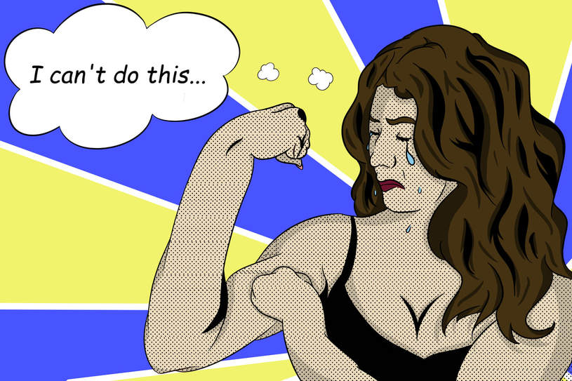
"I Can't Do This... (Karen The Crying Girl) "
Medium: Digital Illustration
Size: 24 in. x 36 in
June 12, 2017
Exhibition Text
Karen Armenta
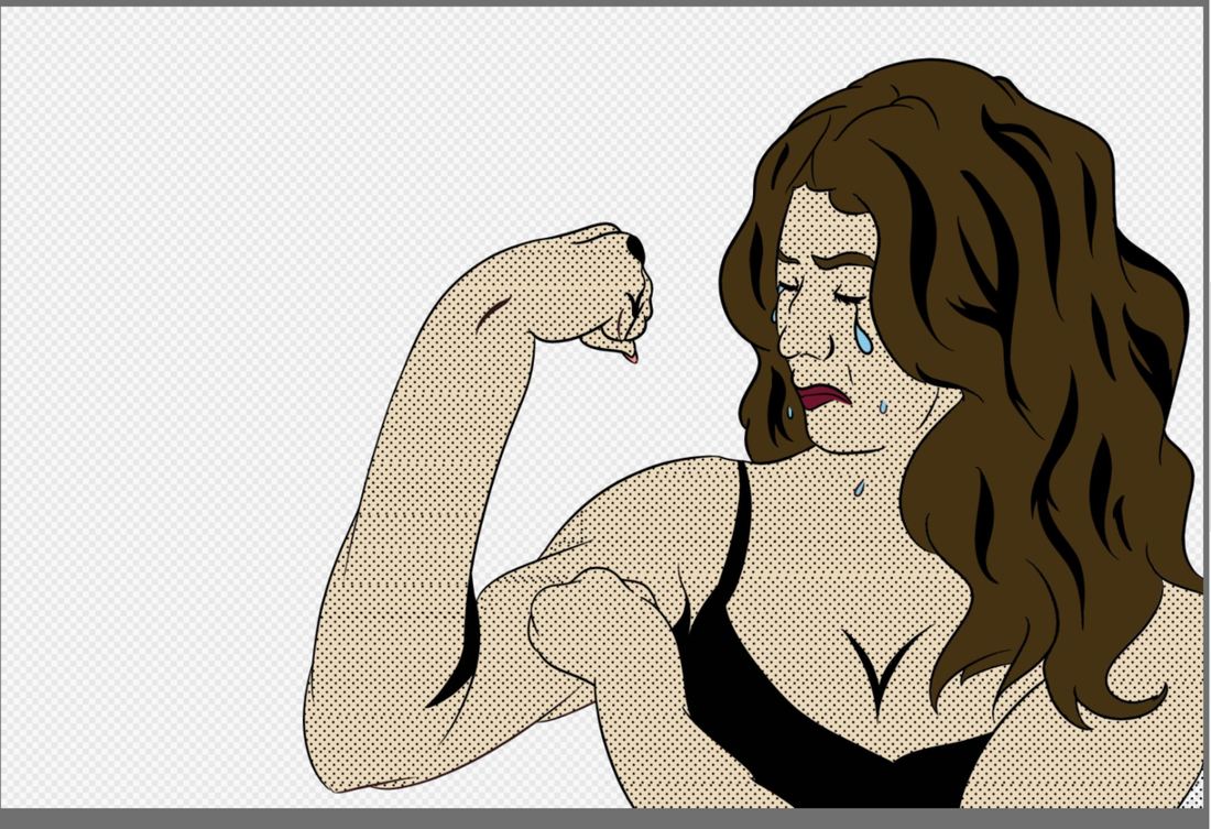
Karen the Crying Girl / I Can't Do This... , 2017
Digital Illustration
This piece, inspired by Roy Lichtenstein’s Crying Girl and war poster Rosie the Riveter, commemorates my failed attempts of romantic relationships with someone of interest. I reflect upon the complexity of my feelings in grief and express the idea of people having the strength to get over hard times but mentally aren’t stable to do so. I highlight my own insecurities about myself, which causes my downfall and leads to doubting myself in everything I do.
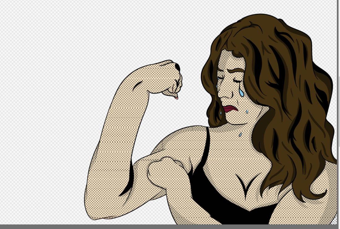
Artistic Inspiration
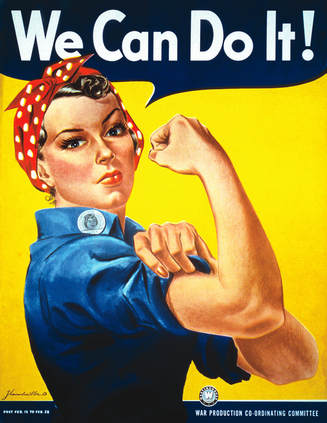
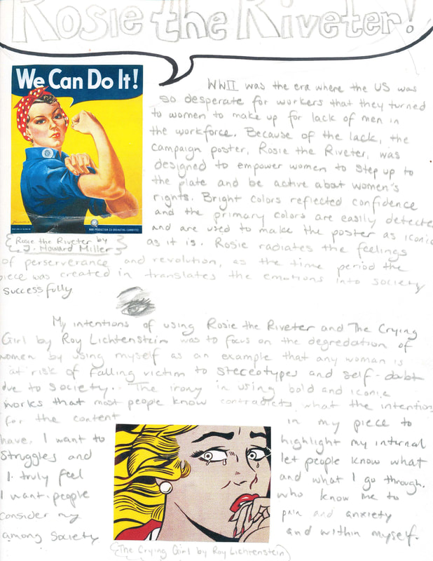
We Can Do It (1942) by J. Howard Miller
|
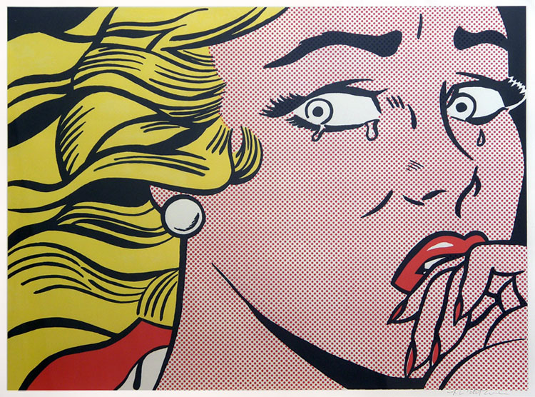
The Crying Girl by Roy Lichtenstein
|
For a while now, I had been wanting to combine my love of pop art with a relevant idea in my life. When I thought of Pop Art, I immediately thought of Roy Lichtenstein. When developing the idea for this piece, I was going through an emotional time, and I remember saying the similar words that was written on the infamous Rosie the Riveter poster. I was inspired to combine the two works together in a self-portrait style that clearly illustrated each artwork's respective traits and my feelings at the time.
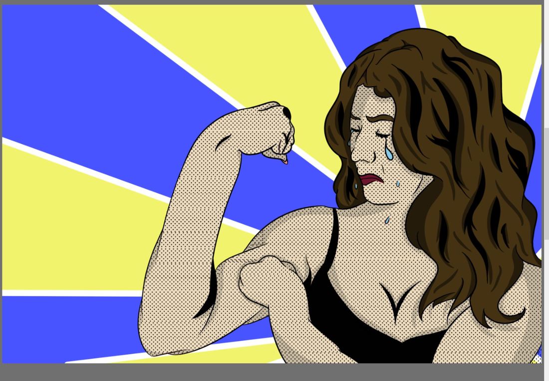
Women's rights during WWII was demonstrated in the Rosie the Riveter poster and cultivated women to gain strength to have the same rights as men. The idea of power and the image of a woman going against gender stereotypes is significantly influential for my piece. I chose similar colors because it felt that it would be a good way to pay homage to the iconic poster from WWII. I also chose a similar pose but a different facial expression to illustrate my feelings of betrayal and grief, which contrasts from Rosie the Riveter.
The Crying Girl by Roy Lichtenstein also portrays a woman who could be defined by stereotypes. I was inspired by this Lichtenstein piece in particular because of its portrayal of the woman. The detail in expression reflects the same emotions I want my audience to feel when they look and interpret my piece. Feelings of sadness and hopelessness is what I want to convey. I also wanted to use the dots that Roy Lichtenstein used as a way to add contrasting texture to the piece and to help highlight my artistic influences more clearly.
|
|
Planning
I was inspired to make something like this after I had experienced a heartbreak the beginning of the summer and wanted to transfer my feelings in an illustration. In my spare time, I took the time to sketch out how I wanted to represent my feelings with the artists who inspired me to create. I brainstormed ideas on how I could portray the feelings of betrayal and grief through the positioning of my body and the facial expressions I made. Because I knew I wanted to produce another self-portrait I wanted to contrast those ideas with the colors I used in the piece so that I could also better highlight my artistic inspirations.
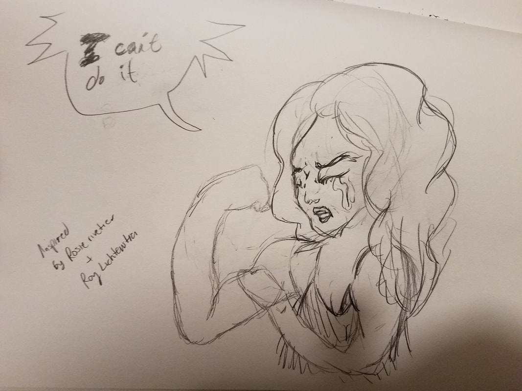
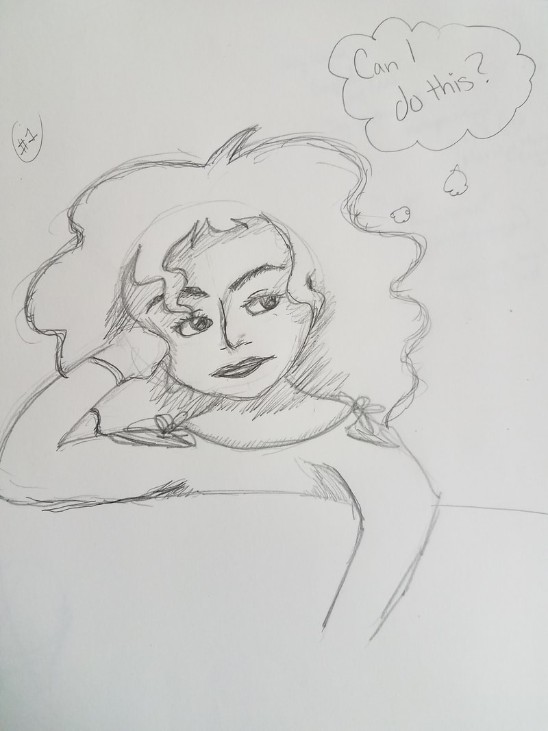
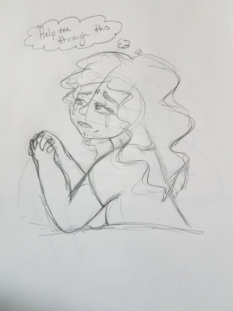
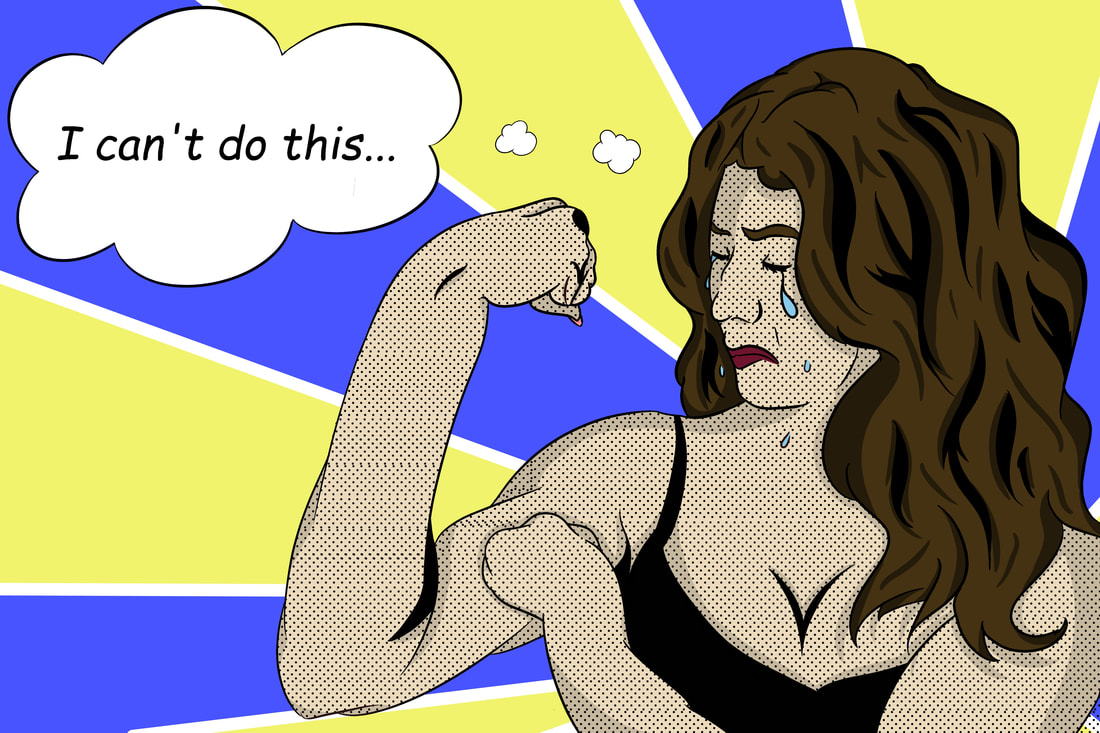
I sketched out three different self-images with three different poses illustrating the ambiguous feelings I had at the time. I focused around the sentiments of confusion, despair, and hopelessness. For one, I tried to copy the same pose of Rosie the Riveter and create a parody of the poster and slogan to better fit my situation. I wanted to show the contrast in hopelessness in my expressions with the body positioning that gave the illusion of strength. Another sketch was to show my confusion about my situation. I wanted to emphasize the extent of my confusion and by having it in the form of a Pop Art styled piece, I could accentuate my expressions through the style. Loosely based off of Rosie the Riveter would be the saying in the bubbled thought, which alludes to my confusion,
I sketched out three different self-images with three different poses illustrating the ambiguous feelings I had at the time. I focused around the sentiments of confusion, despair, and hopelessness. For one, I tried to copy the same pose of Rosie the Riveter and create a parody of the poster and slogan to better fit my situation. I wanted to show the contrast in hopelessness in my expressions with the body positioning that gave the illusion of strength. Another sketch was to show my confusion about my situation. I wanted to emphasize the extent of my confusion and by having it in the form of a Pop Art styled piece, I could accentuate my expressions through the style. Loosely based off of Rosie the Riveter would be the saying in the bubbled thought, which alludes to my confusion,
I ultimately went with my first sketch because I thought that it reflected most of what I was going through at the time. I wanted to include my own interpretation of myself via how others think I am. This self-portrait styled sketch seemed to be the best way to demonstrate the more intimate side of me and how easily distressed I can be, which might not come off easily I perceive myself to be.
Process
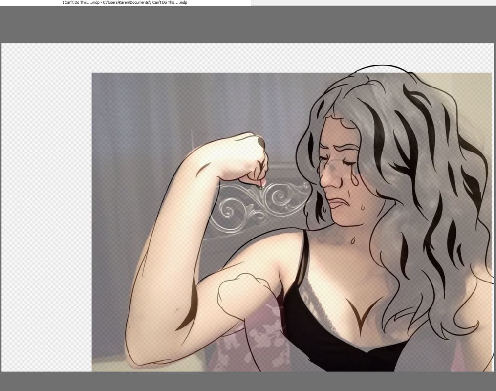
After planning how I wanted to portray my feelings through a specific sketch and took reference pictures, I uploaded the image onto my laptop and used the free program, FireAlpaca, to make my illustration. I created multiple layers that were intended for every aspect I wanted to include in my picture. I had a layer for the sketch, the lineart, the color, the shading, the dots, the background, and the text. Keeping every part of the piece separate is key when working digitally since it is easier to fix common mistakes when focusing on something.
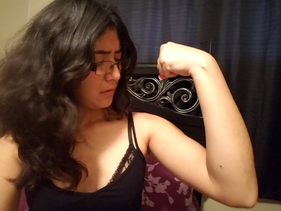
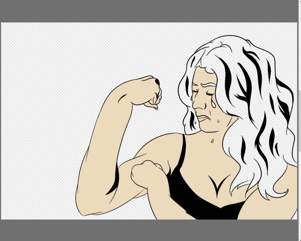
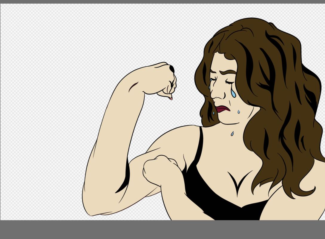
I uploaded the image I was going to use on a separate layer and on another layer, began to outline/trace myself. I emulated the same use of varying straight, thick, and thin lines that are evident in Lichtenstein's works. I filled in the areas of depth and more value with black to make the piece more bold and defined. Once having the image traced over, I turned the opacity level of the layer that had the image to 0 so that I could see the drawing by itself. I went ahead and added my skin color to a new layer under the lineart layer so that I could use the paint bucket tool and make coloring a lot easier and cleaner. I then added the brown color to my hair on a separate layer, as well as my lip color and color of my tears. I then made a new layer to add the same dots print that Lichtenstein uses in a lot of his works. There was a pre-made tool that created trails of dots and you could adjust it to be whatever size and distance apart as you wanted. After doing that, on another layer, I added a shade of gray in areas that helped define form.
For that layer, I changed the setting of the layer to be multiply so that the color gray would take on the darker value of the color that the gray was being put on. It would be the color blended with that gray. After applying the shading, I focused on the background and made a 'rays' of color that came off of my figure. On a separate layer, I added text and then drew a thinking bubble to place the text. I adjusted everything using opacity leveling and ended up keeping everything at 100% to keep the colors well saturated.
Experimentation
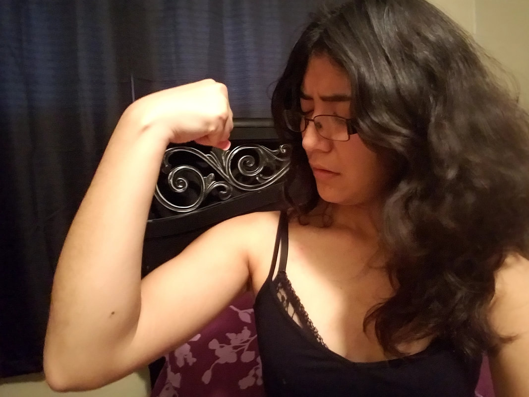
I had originally taken the picture a certain way, but thought it resembled too much like Rosie the Riveter so I decided to change the positioning of how I was by flipping the image so that it would face the other direction. The intent was to make the piece show the inspiration, but to not exactly mimic it. The same applied with the inspiration from Lichtenstein. I took pictures that had different facial expressions until I got it to be the one I wanted. The facial expressions differed from the ones Lichtenstein uses, as a good portion of his works includes mistresses who are crying, while I am not physically crying. I add the tears in as exaggeration to emulate Lichtenstein's works.
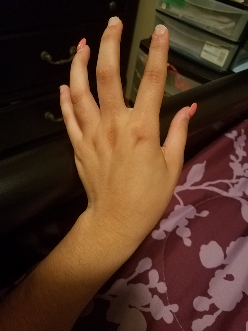
I decided to trace along the outline of my body and face because I have unsteady hands and am not good at free drawing digitally. I wanted to be as accurate as possible so that my piece could be considered a self-portrait. I had originally took a picture of my hand to practice drawing hands, but that didn't work out so well. Instead of having an open hand grasping onto my bicep, I decided to have a closed fist lightly touching my bicep. It is a little deformed due to the fact that my fist was free-drawn and had no reference when drawing it, but i used that opportunity to test my skills at realistic, digital drawing .
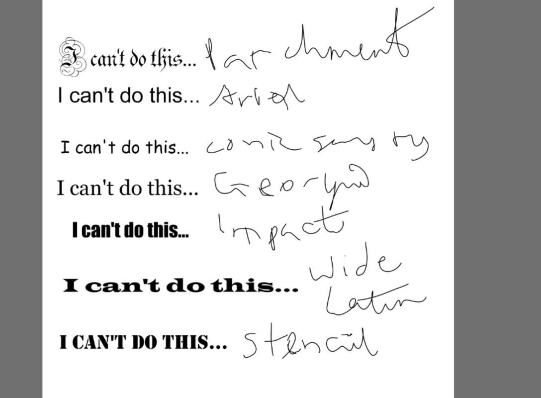
When applying the text to the image, I decided to play around with the different fonts to see which one would help better my image. On a different document, I typed the phrase, "I can't do this", multiple times and changed the fonts of every one of them to see which one would look best with my piece. In the end, I chose to put it in the font Comic Sans MS. This was intentional because I know that most designers would NEVER use Comic Sans MS as a font for anything, and I wanted to mock that in my work. Plus, I love the font in its entirety. I felt that the childish and nostalgic font is a juxtaposition with the serious and heavy content the phrase actually holds. It makes the phrasing and appearance more meaningful in my work.
I decided to trace along the outline of my body and face because I have unsteady hands and am not good at free drawing digitally. I wanted to be as accurate as possible so that my piece could be considered a self-portrait. I had originally took a picture of my hand to practice drawing hands, but that didn't work out so well. Instead of having an open hand grasping onto my bicep, I decided to have a closed fist lightly touching my bicep. It is a little deformed due to the fact that my fist was free-drawn and had no reference when drawing it, but i used that opportunity to test my skills at realistic, digital drawing .
When applying the text to the image, I decided to play around with the different fonts to see which one would help better my image. On a different document, I typed the phrase, "I can't do this", multiple times and changed the fonts of every one of them to see which one would look best with my piece. In the end, I chose to put it in the font Comic Sans MS. This was intentional because I know that most designers would NEVER use Comic Sans MS as a font for anything, and I wanted to mock that in my work. Plus, I love the font in its entirety. I felt that the childish and nostalgic font is a juxtaposition with the serious and heavy content the phrase actually holds. It makes the phrasing and appearance more meaningful in my work.
Reflection
This piece in its final stage means a lot to me. I can easily say that this is one of the works I am most proud of. I was able to put all of my emotions into this one piece and it turned out the way I wanted it to. I feel like the bright, primary colors yellow and blue are aesthetically pleasing. I chose crimson lips because in real life, I wear a lot of lipsticks, and the one I favor the most is deep burgundy reds. I feel happy looking at the picture, even if the piece itself is meant to be melancholy and reflective. The artistic inspiration is clearly illustrated from the colors, to the style, and to the positioning of myself. Again, I wanted to emphasize the struggle to find stability in relationships that I have and my constant struggle of feeling insecure in everything I do. I feel really attached to this piece, as I put a lot of thinking and meaning into this piece. I've gotten feedback from my peers and they agree that the artistic inspirations are evident, and although they do not know exactly what the true meaning behind this piece is, they understand that I was going through a tough time. The text gave that hint, as well as my facial features. I
As the artist, I have subtle flaws that not many people might notice in the piece, If I were to do this again, I would go back and spend more time carefully arranging the dots because some are close together, and some are farther apart. I would also try shading more areas, but chose not to because I was scared of overdoing it. I struggled to freehand my fist near my bicep, since I normally do not draw people. I should take the time to study the human anatomy and give figure drawing a shot.
One of my other ideas I had for this piece was to emulate a Marilyn Monroe-esque piece like that of Andy Warhol and keep the same content and posture as Rosie the Riveter. I would have also emphasized the degradation of women through his artistic influence, but I felt it didn't go well with the connection to my internal struggle. I might incorporate this idea in a future project I have in mind.
Connection to ACT
Identify cause and effect relationships between your inspiration and your artwork.
The content of Rosie the Riveter definitely caused a huge influence in my piece. I included similar poses and phrases, as well as colors. My interpreted theme of the piece also is reflected in my work, as woman empowerment is shown to be a juxtaposition within my piece. Lichtenstein's style greatly influenced my work as well. I wanted to include the nostalgic feeling from the comic style to break the tension of the serious content I display in my art.
What is the overall approach the author has regarding the topic of your inspiration?
Both artists show appreciation towards females, and I feel they both had similar intentions. Rosie the Riveter was a poster that was used as propaganda to encourage women, while Lichtenstein's work shone a light towards the hypocritical stereotypes of women. Each in its own was a message to society about women, and as a woman, I wanted to use both styles to display my struggles as a woman and my own life.
What kind of generalizations and conclusions have you discovered about people, ideas, cultures, etc. while you researched your inspiration?
I better understood the impact of stereotypes among different societies. As a young, Hispanic woman, I have my fair share of situations where I am held at a lower degree because of how I classify myself, whether it be physically, culturally, socially, or mentally. Both works and styles that I researched helped better my work's message and central idea and helps connect my own personal experiences to the styles.
What was the central idea or theme around your inspirational research?
The central idea for my inspirational research was the misinterpretation of women and the hardships that comes with coming to terms with relationships, including the one with yourself. Self-awareness and awareness of society played a major role in the development of my research, as I wanted to learn more about the common stereotypes women from different time periods faced and how women lived their lives in different cultures.
What kind of inferences did you make while reading your research?
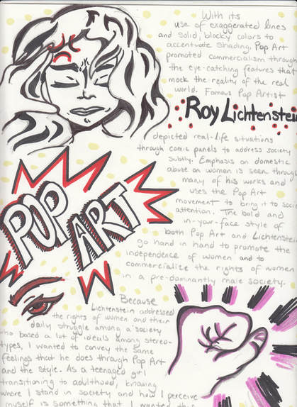
I assumed that Pop Art was all about consumerism but I was completely wrong. Pop Art was more than just propaganda, and it allowed for artists like Lichtenstein to speak up about social issues among a society where image was everything.
The content of Rosie the Riveter definitely caused a huge influence in my piece. I included similar poses and phrases, as well as colors. My interpreted theme of the piece also is reflected in my work, as woman empowerment is shown to be a juxtaposition within my piece. Lichtenstein's style greatly influenced my work as well. I wanted to include the nostalgic feeling from the comic style to break the tension of the serious content I display in my art.
What is the overall approach the author has regarding the topic of your inspiration?
Both artists show appreciation towards females, and I feel they both had similar intentions. Rosie the Riveter was a poster that was used as propaganda to encourage women, while Lichtenstein's work shone a light towards the hypocritical stereotypes of women. Each in its own was a message to society about women, and as a woman, I wanted to use both styles to display my struggles as a woman and my own life.
What kind of generalizations and conclusions have you discovered about people, ideas, cultures, etc. while you researched your inspiration?
I better understood the impact of stereotypes among different societies. As a young, Hispanic woman, I have my fair share of situations where I am held at a lower degree because of how I classify myself, whether it be physically, culturally, socially, or mentally. Both works and styles that I researched helped better my work's message and central idea and helps connect my own personal experiences to the styles.
What was the central idea or theme around your inspirational research?
The central idea for my inspirational research was the misinterpretation of women and the hardships that comes with coming to terms with relationships, including the one with yourself. Self-awareness and awareness of society played a major role in the development of my research, as I wanted to learn more about the common stereotypes women from different time periods faced and how women lived their lives in different cultures.
What kind of inferences did you make while reading your research?
I assumed that Pop Art was all about consumerism but I was completely wrong. Pop Art was more than just propaganda, and it allowed for artists like Lichtenstein to speak up about social issues among a society where image was everything.
Bibliography
"Rosie the Riveter" is not the same as "We can do it!", www.docspopuli.org/articles/RosieTheRiveter.html. Accessed 25 Sept. 2017.
Stamberg, Susan. “One Dot At A Time, Lichtenstein Made Art Pop.” NPR, NPR, 15 Oct. 2012, www.npr.org/2012/10/15/162807890/one-dot-at-a-time-lichtenstein-made-art-pop. Accessed 25 Sept. 2017.
Stamberg, Susan. “One Dot At A Time, Lichtenstein Made Art Pop.” NPR, NPR, 15 Oct. 2012, www.npr.org/2012/10/15/162807890/one-dot-at-a-time-lichtenstein-made-art-pop. Accessed 25 Sept. 2017.
