Project #3: Digital Self-Portrait
"i'M a MeSs"
Medium: Digital Illustration
Size: 36 in. x 36 in.
October 15, 2017
Exhibition Text
Karen Armenta
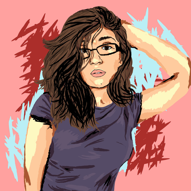
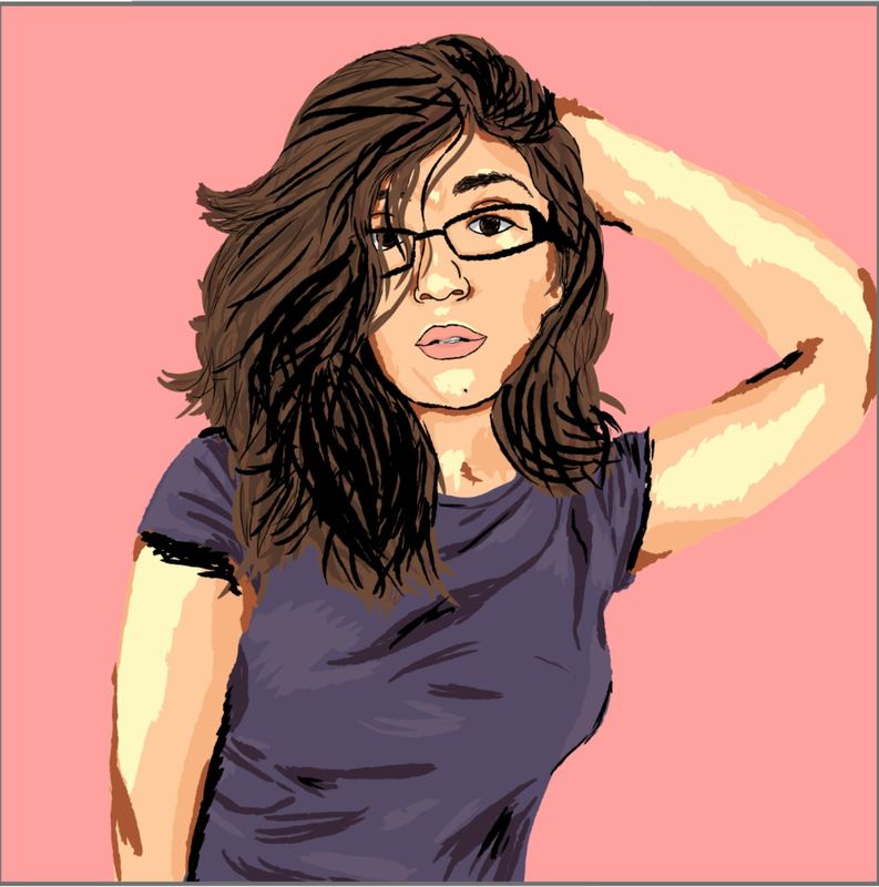
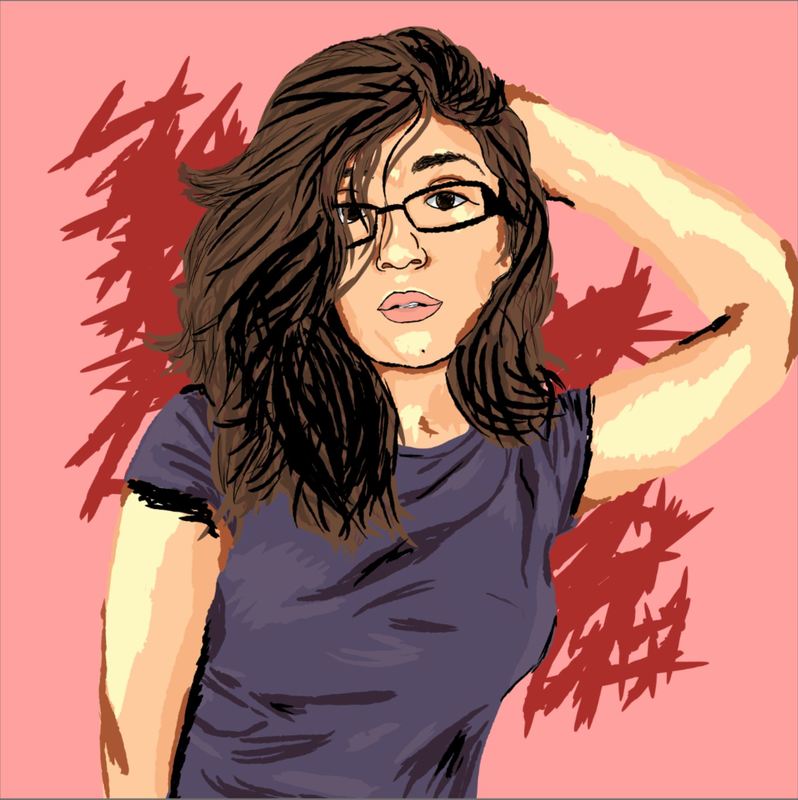
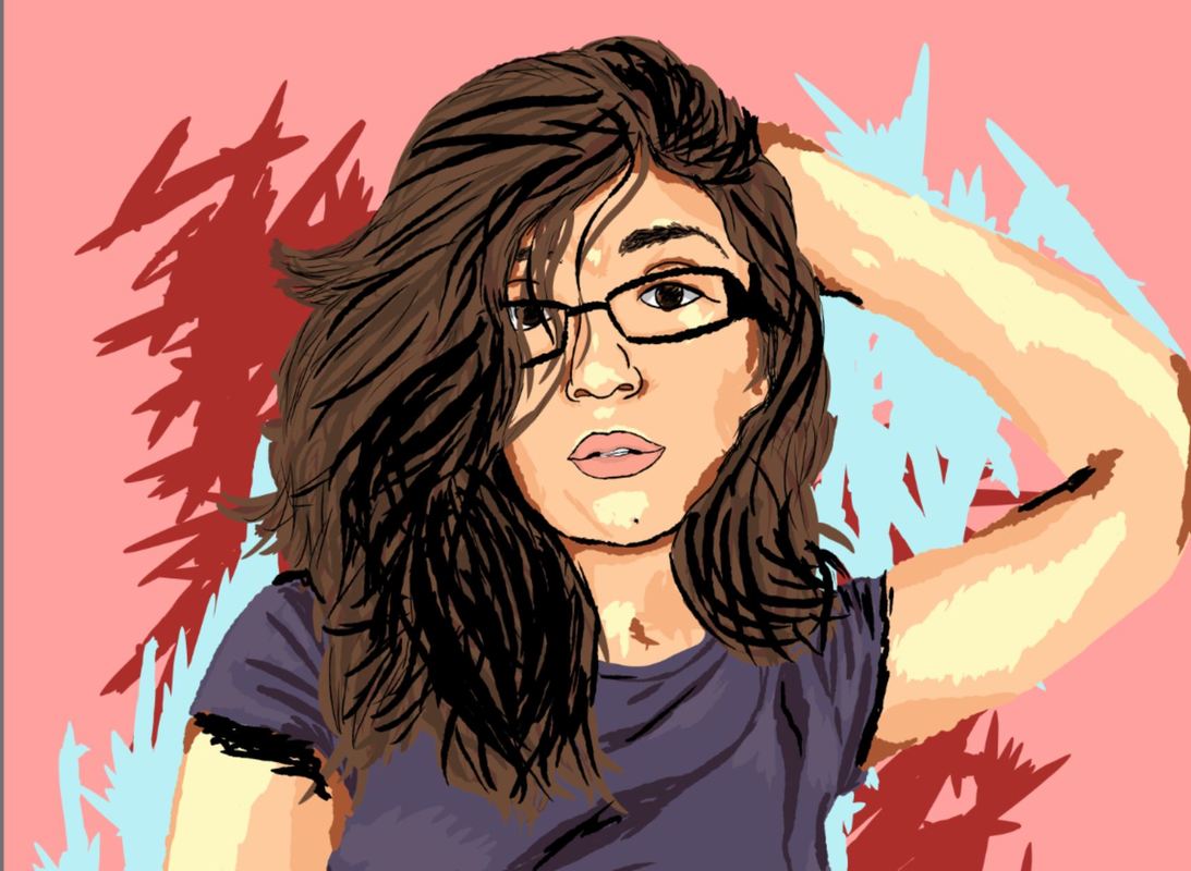
i'M a MeSs, 2017
Digital Illustration/Self Portrait
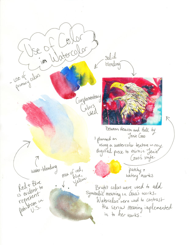
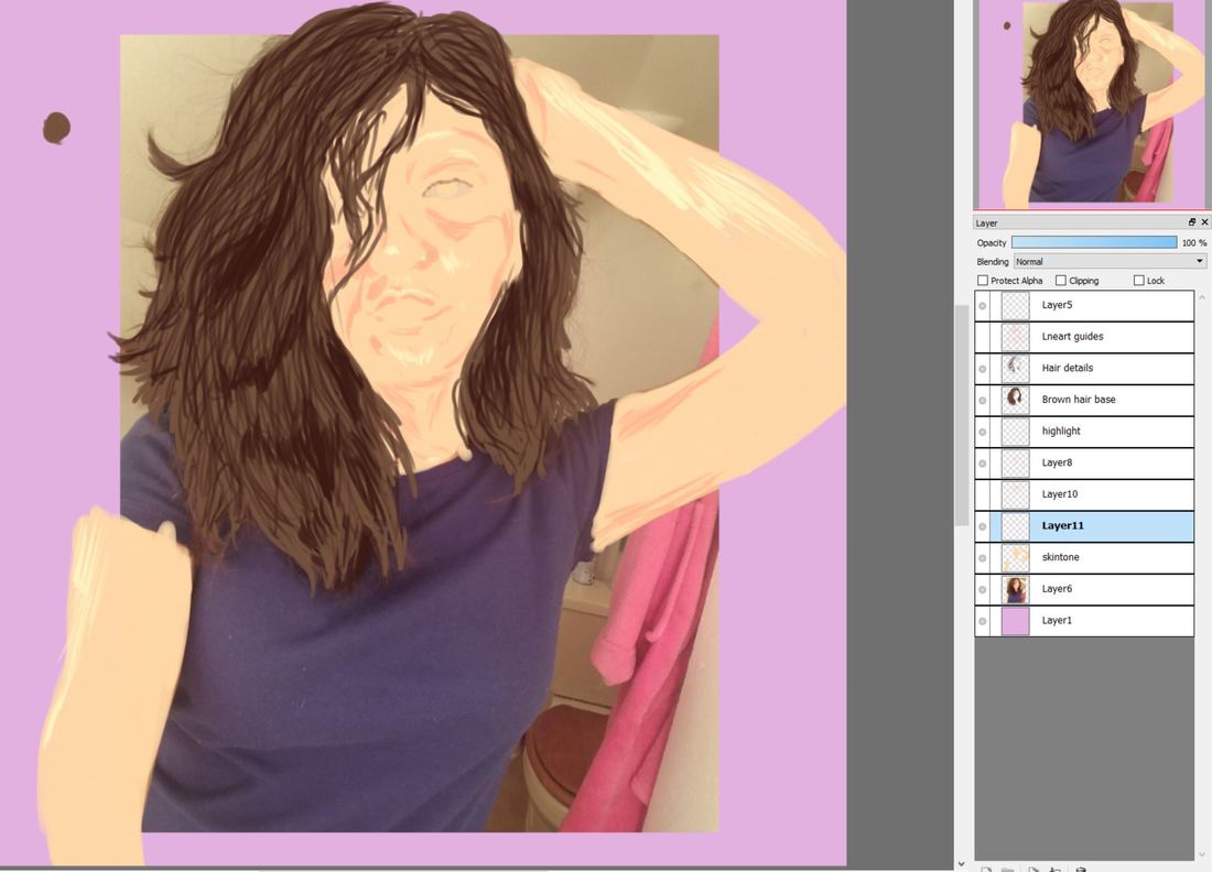
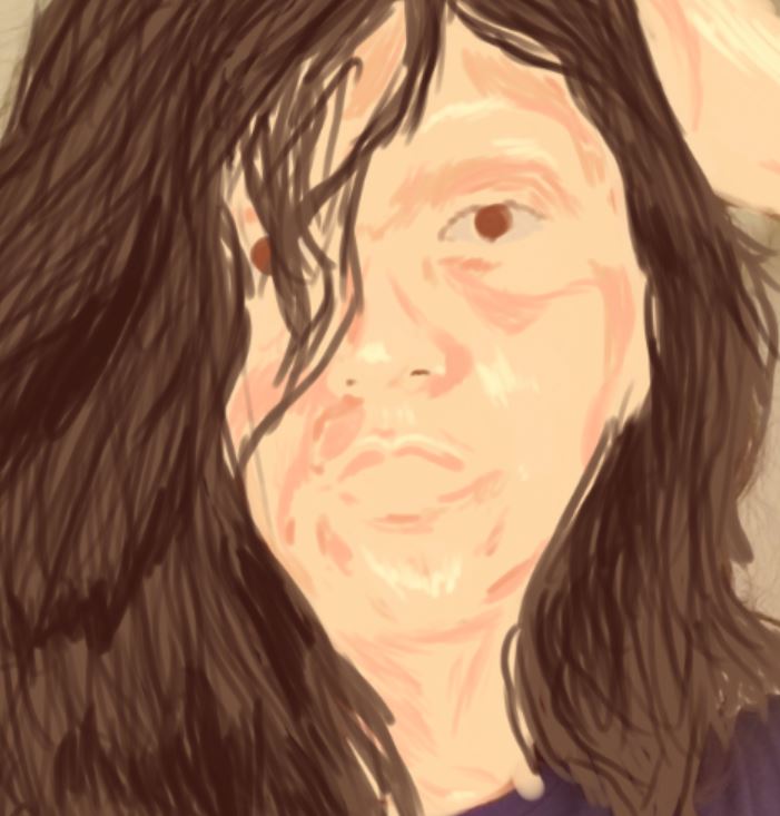
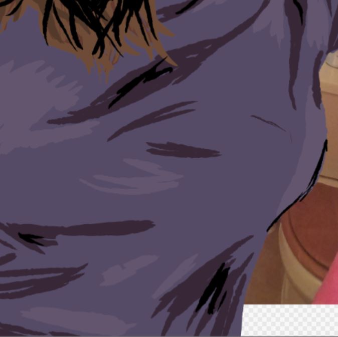
Illustrating my heavy workload, this digital self-portrait, inspired by Warhol’s Shot Light Blue Marilyn and Jeni Gao’s Between Heaven and Hell, uses fast lines and unblended colors to add feelings of being rushed. My facial expression mimics the weariness I feel over managing my work, school, and personal image. Time stops for no one, as much as I want it to sometimes. This piece captures a rapid state, emphasizing the obsession of myself in my current state of time through line and texture.
i'M a MeSs, 2017
Digital Illustration/Self Portrait
Illustrating my heavy workload, this digital self-portrait, inspired by Warhol’s Shot Light Blue Marilyn and Jeni Gao’s Between Heaven and Hell, uses fast lines and unblended colors to add feelings of being rushed. My facial expression mimics the weariness I feel over managing my work, school, and personal image. Time stops for no one, as much as I want it to sometimes. This piece captures a rapid state, emphasizing the obsession of myself in my current state of time through line and texture.
Artistic Inspiration
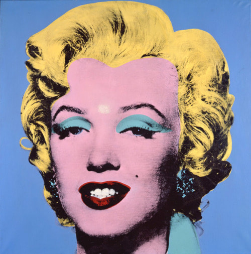
Shot Light Blue Marilyn by Andy Warhol
|
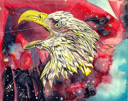
Between Heaven and Hell by Jenie Gao
|
|
“Modern/ contemporary photography & beyond.” Pinterest, 13 Feb. 2016, www.pinterest.com/pin/165225880057935663/.
|
“Jenie Gao Studio.” Jenie Gao Studio, jenie.org/#img/gallery/art/2016/2016LasPioneras.html.
|
My intent was to portray myself with blocks of color and keep my consistent theme of identity. I chose to draw inspiration from Andy Warhol as he explored the human face through experiments with colors and pattern and technique. I planned to make my piece look digital and realistic in the sense that color-blocking would make up for the lack of blending, like in Shot Light Blue Marilyn by Andy Warhol. I knew I also wanted to incorporate local artist Jenie Gao's artistic qualities into my piece as she also played around with colors. I wanted to mess around with my use of colors like Jenie Gao but decided to use it in the background and then use similar color choices as Andy Warhol did.
The idea of oppression in society is prominent in both Warhol and Gao's works, but is portrayed differently in each work. Warhol specializes in meaning through portraits while Gao strategically implements her opinions through symbolic objects and backgrounds. A major factor that inspired both artists were the alienation of human rights, both politically and stereotypical. Stereotypes play a huge role in the development of meaning in both Gao and Warhol's work and I wanted to have my own spin from these artists portrayal of their meaning. The intent for my piece is to emphasize the stereotype of a high school student and how it has become my reality in the sense of stress levels and workloads in my senior year.
|
|
Planning
Again, I was inspired by Andy Warhol, but this time with his portraits of people. In a way, I wanted to continue my experimentation and artworks with identity and the human face. I took pictures of myself in distinctive times to portray myself in new ways, but in the way that they all are me. Of course, no picture is the same and we all have our angles or versions of ourselves that we want people to see and I decided to choose specific shots to represent a certain idea instead of a sketch. I wanted to plan through photograph and play with lighting to get visuals as to how I could go about each picture I took depending on the day and what I did before and during the pictures. I knew before this piece that I wanted to produce another digital work and thought about how I could illustrate each picture if I were to recreate them digitally.
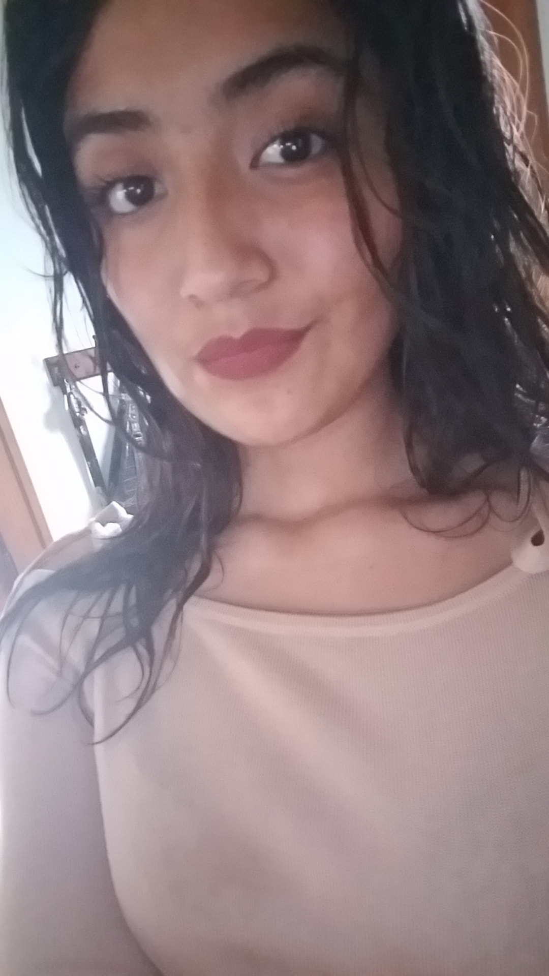
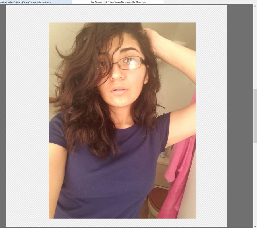
For the first picture I took, it was after I had showered so I still had wet hair and I was getting ready, so I applied minimal makeup. The thing that I liked about this reference picture was the lighting, as it gave off a cooler tone to it, which gave me the idea to possibly make a digital work with cool colors like greens and blues. In addition to the color, I wanted to also incorporate my wet hair in my piece so I was thinking of making my piece almost like an underwater texture with vibrant cool colors. My lips would remain red to contrast from the cool colors.
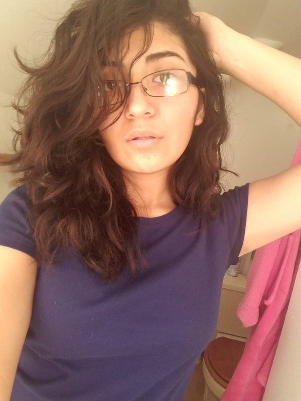
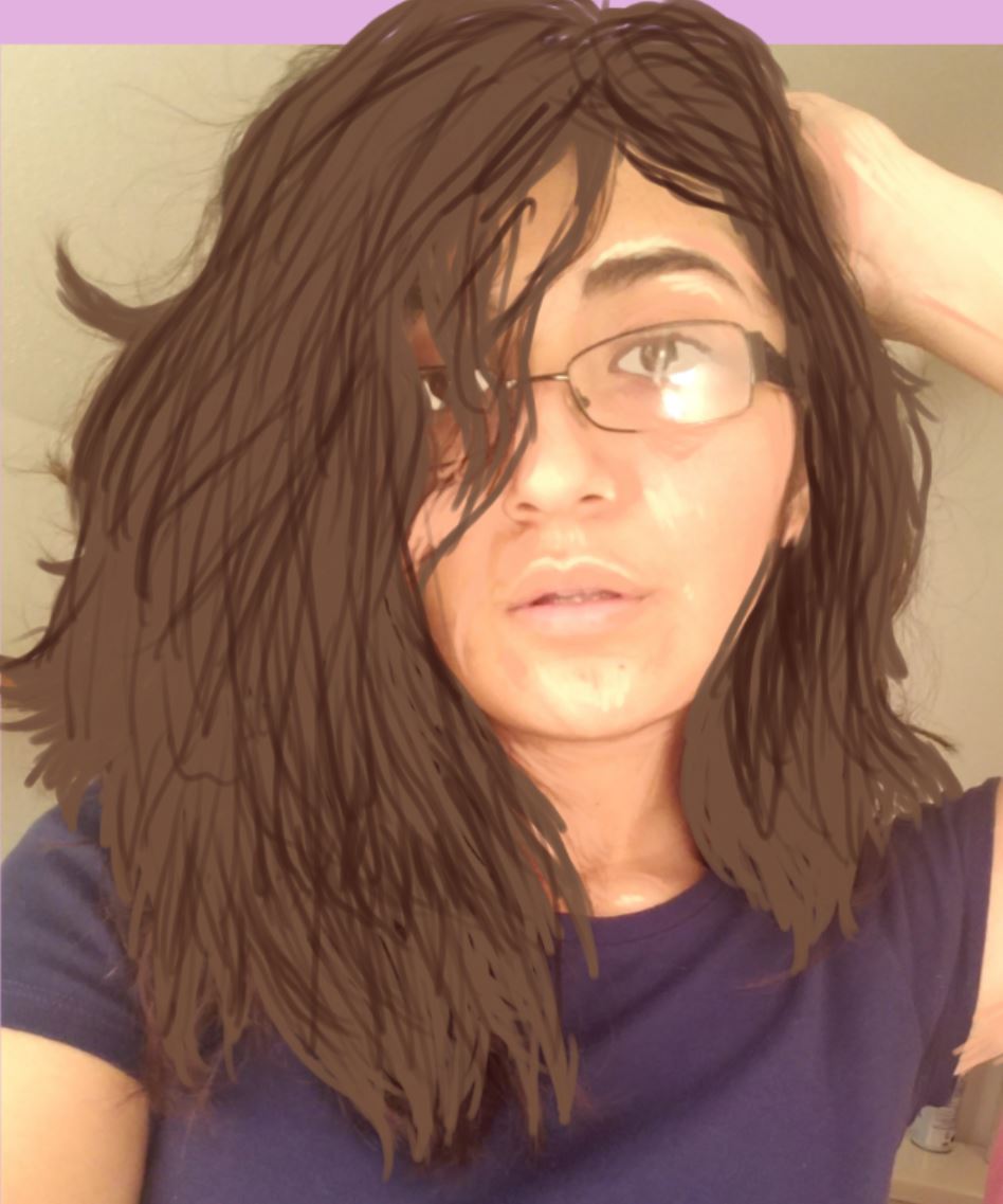
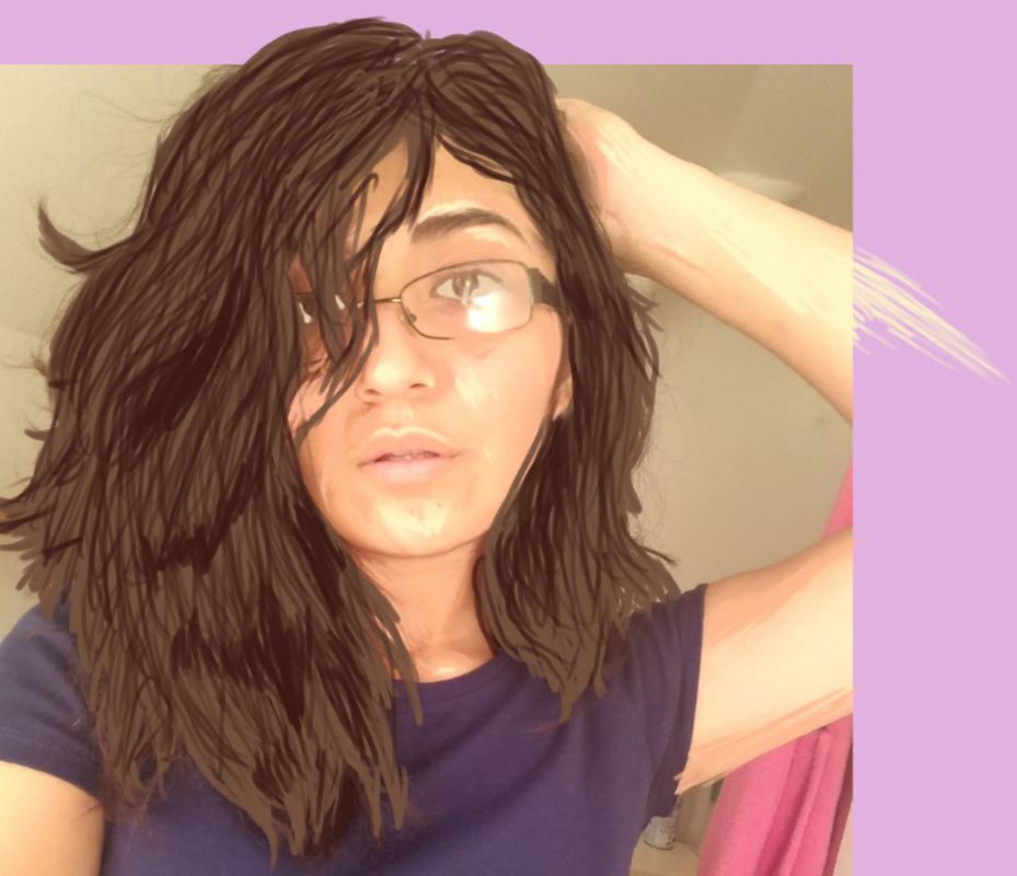
The next picture was taken in my heavily lighted and saturated bathroom. I wanted to take a picture there because of how strong the lighting was in there. It made my complexion much more warmer and lighter, which I though would be interesting to replicate digitally. I had purposefully posed to accentuate the fluffiness of my hair and its texture/volume and to also give the feeling of unease and woe. In the picture, I also was wearing no makeup, which added to the naturalness of my portrayal. Originally, I was intending for this reference picture to be recreated to look as realistic as possible and include warm tones and have a watercolor background with yellows and oranges and browns.
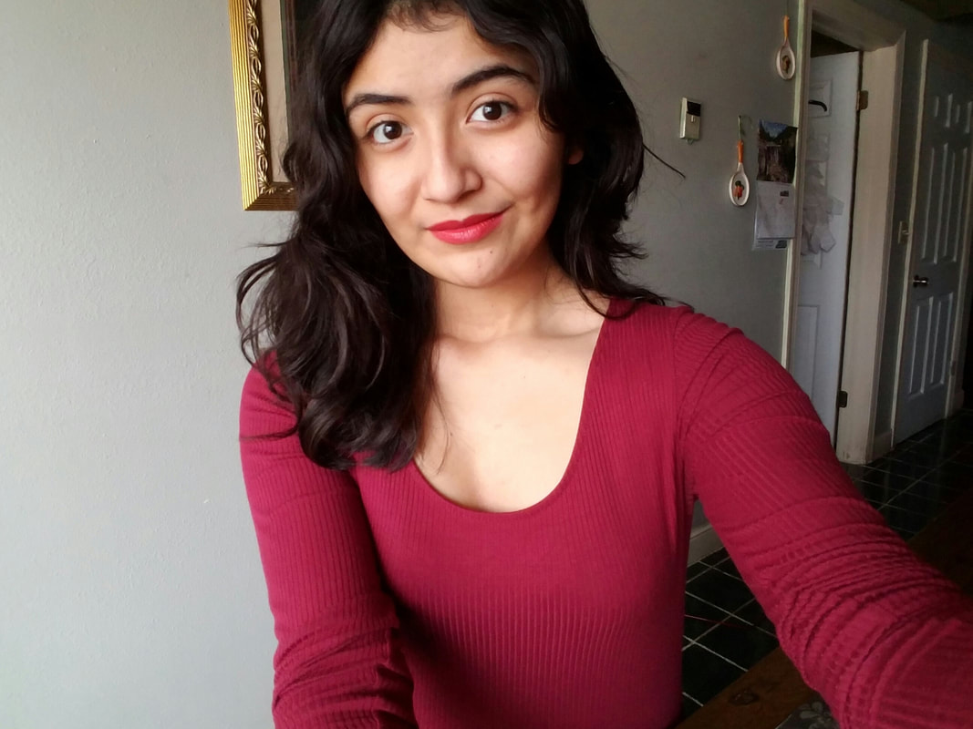
The last picture was taken where sunlight/natural light was seeping through a huge window, At the time, I wanted to show off my true complexion in broad daylight and have a clear representation of every feature on my face. Of course, I was only wearing lipstick to mimic my original inspiration, Shot Light Blue Marilyn. For this piece, I was thinking about highlights and the emphasis on the color red, almost like the Romantic Period Picasso had in his career. I wanted to add a blocky texture much like Andy Warhol and give it a Pop Art appearance.
In the end, I chose the middle picture as I was originally drawn to the posture and the naturalness of my portrayal. This idea went along with my inspirations use of headshots/portraits and theme of identity, and also the intentions of using splashes of color in the background like Jenie Gao.
For the first picture I took, it was after I had showered so I still had wet hair and I was getting ready, so I applied minimal makeup. The thing that I liked about this reference picture was the lighting, as it gave off a cooler tone to it, which gave me the idea to possibly make a digital work with cool colors like greens and blues. In addition to the color, I wanted to also incorporate my wet hair in my piece so I was thinking of making my piece almost like an underwater texture with vibrant cool colors. My lips would remain red to contrast from the cool colors.
The next picture was taken in my heavily lighted and saturated bathroom. I wanted to take a picture there because of how strong the lighting was in there. It made my complexion much more warmer and lighter, which I though would be interesting to replicate digitally. I had purposefully posed to accentuate the fluffiness of my hair and its texture/volume and to also give the feeling of unease and woe. In the picture, I also was wearing no makeup, which added to the naturalness of my portrayal. Originally, I was intending for this reference picture to be recreated to look as realistic as possible and include warm tones and have a watercolor background with yellows and oranges and browns.
The last picture was taken where sunlight/natural light was seeping through a huge window, At the time, I wanted to show off my true complexion in broad daylight and have a clear representation of every feature on my face. Of course, I was only wearing lipstick to mimic my original inspiration, Shot Light Blue Marilyn. For this piece, I was thinking about highlights and the emphasis on the color red, almost like the Romantic Period Picasso had in his career. I wanted to add a blocky texture much like Andy Warhol and give it a Pop Art appearance.
In the end, I chose the middle picture as I was originally drawn to the posture and the naturalness of my portrayal. This idea went along with my inspirations use of headshots/portraits and theme of identity, and also the intentions of using splashes of color in the background like Jenie Gao.
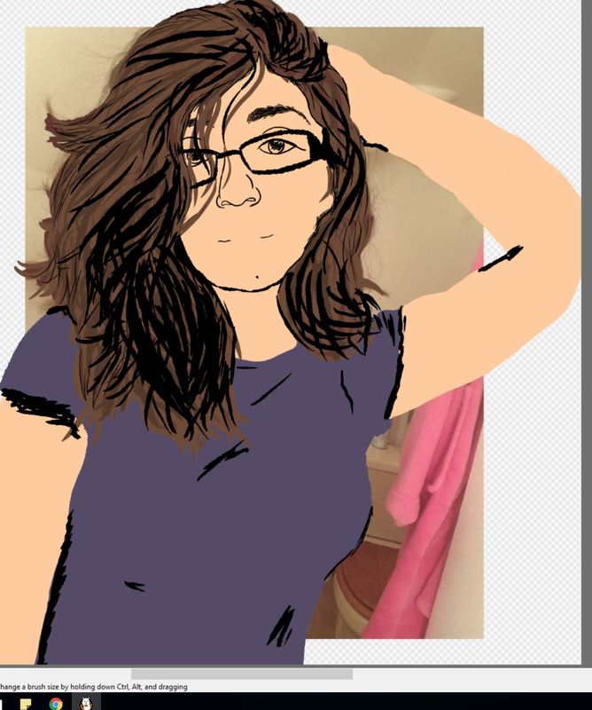
Process
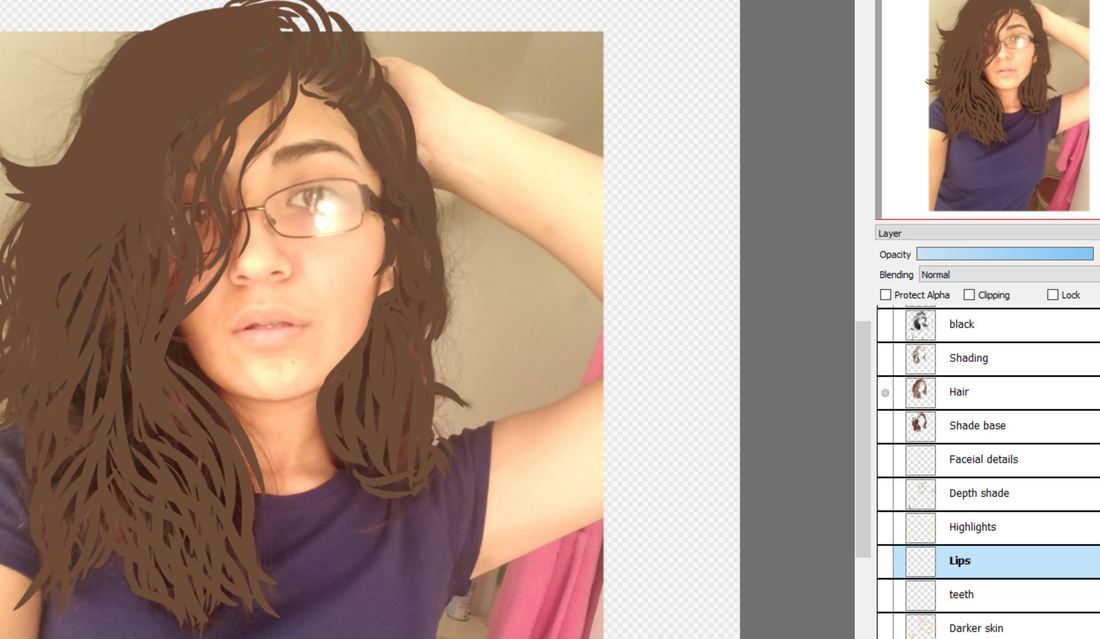
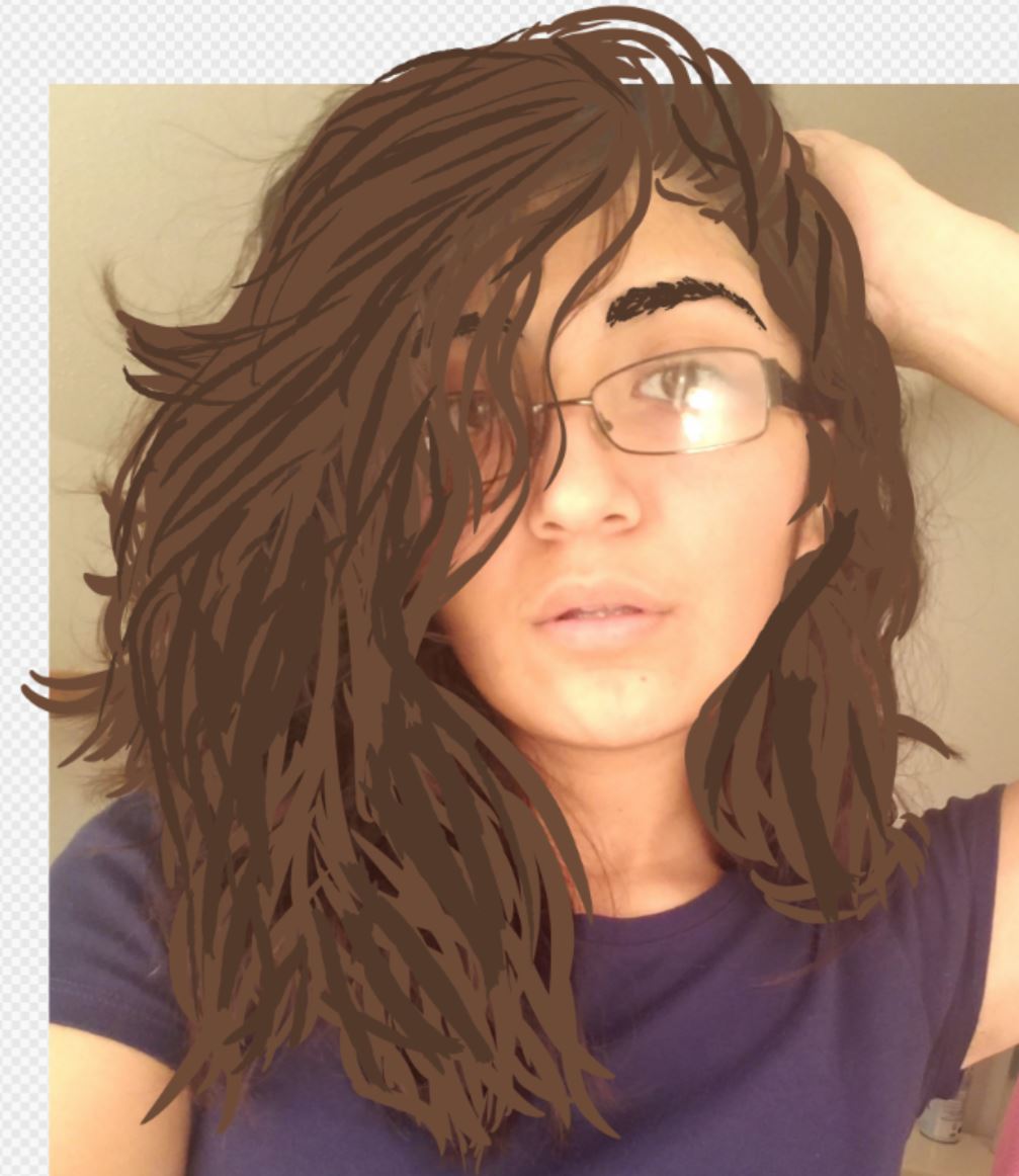
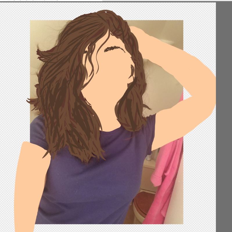
I first uploaded my reference shot in a new layer and toned down the opacity so it was easier to see as I outlined my figure with solid colors. I went straight to filling in different sections with colors on new layers instead of outlining as if I were making line art because I wanted to emulate the blocky texture Andy Warhol does in his Marilyn portraiture. Each body part I did on a separate layer and I also separated the individual colors to have their own layer. so that it would be easier to compile color after color without mixing. This effect would lead to the same effect that Andy Warhol's style portrays.
I first layered on the colors of the hair as it served as a basis for the face. I continued with the base skin color.and added the shading of the black in the hair and areas where I knew were going to be the most heaviest in shading. I also took the time to add facial features where they were supposed to go by turning the sight of the skin tone layer off to outline my facial features. Later on I added the highlights and darker shades of my skin face and arms and added more detail to my eyebrows and hair.
Once finishing my face and adding the lips, I focused on my shirt and the folds and creases created from my chest. I stroked heavily when creating the creases in my shirt and layered darker colors on top of gradients to give the illusion of depth and form. After adding the black to the final shading, I continued with the background. I then added the streaky background with contrasting colors in the same style I did when I painted the shading in my arms and face.
Experimentation
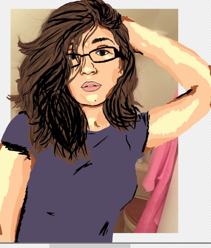
I had originally tried for a more realistic digital self portrait, as I wanted to keep my style of realism consistent in my works. After much attempt to try and make it look as realistic as possible through my program and with thin lines,I tried my best to include what I did when I physically painted to my digital painting but I found it more difficult. I ultimately gave up on the challenge as I still wasn't too experienced with my program and how to blend properly. I then decided to experiment with other styles, which forced me to stray away from my tendency to make things as realistic as possible. I found a little ease with doing something bold and something that wasn't me, yet I still stayed consistent with my own style.
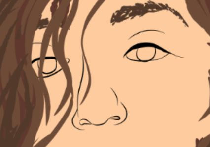
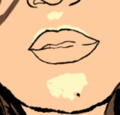
I changed my style halfway through the progression of my first attempt of a self portrait and decided to use solid shades of colors to represent shading and maintain a cartoon-ish feel. As I continued to progress with my new style, I questioned how I should represent my facial features. I was unsure of making the facial features outlined with fine lines or outline them with the same blockiness of the shading that I utilized in highlights and shading. I had the same problem with the lips as I was unsure if I should leave the lips without a black outline or add one. I did the same with the creases of my shirt. I was indecisive about whether I should add black to the already shaded areas of the shirt.
I changed my style halfway through the progression of my first attempt of a self portrait and decided to use solid shades of colors to represent shading and maintain a cartoon-ish feel. As I continued to progress with my new style, I questioned how I should represent my facial features. I was unsure of making the facial features outlined with fine lines or outline them with the same blockiness of the shading that I utilized in highlights and shading. I had the same problem with the lips as I was unsure if I should leave the lips without a black outline or add one. I did the same with the creases of my shirt. I was indecisive about whether I should add black to the already shaded areas of the shirt.
Reflection
The end results really surprised me. I was expecting something completely different from this piece, as I had anticipated this piece look as realistic as I wanted it to be. I'm very satisfied with my results, as I didn't expect myself to produce something like this. I strongly believe that my intent to show my own discomfort and levels of stress of being a senior is evident in my piece. The fast and jagged lines used to make up the shading and form of my appearance greatly impacts the way my piece feels. The accuracy in the inaccuracy of detail compensates for the serious mood that I want to reflect in my piece.
If I were to change this, I would not paint my shirt on and cover up my "modesty" with something that relates to the stress that I am going through. The reason why I would not paint my shirt is to stay consistent with my original theme of self-identity and staying true to myself. However, I felt that exposing too much would be risky and reconsidered. I ultimately found a compromise that would include the honesty to myself without having to expose myself too much. The compromise was put towards my facial expression as I intentionally made my face to look uneasy and distressed and it can also look a little sensual.
My intentions for everything I did in my piece is all expressed through the title of the piece, as I had titled it "i'M a MeSs". The title exaggerates how I am overwhelmed by my life as a senior in high school. It is also a heavy allusion to the SpongeBob memes that is meant to mock situations through the spelling of words and jumbled capitalization of letters. The whole idea of the perception of the title is meant to reflect everything about my piece. I feel as though my life is jumbled and not in order and I stress out a lot and this piece in its whole is a visual representation of this.
Connection to ACT
Identify cause and effect relationships between your inspiration and your artwork.
The perception of people and identity is seen through both artists I drew inspiration from and in turn, led to me interpreting my own state of being through stereotypes of a high school student and being very stressed out.
What is the overall approach the author has regarding the topic of your inspiration?
My inspirations focus heavily on stereotypes and the representation of culture through symbolism. Andy Warhol used portraits while Jenie Gao used symbolism through language and animals/objects.
What kind of generalizations and conclusions have you discovered about people, ideas, cultures, etc. while you researched your inspiration?
I have found that many people believe that Andy Warhol was a person who objectified women because of his portrayals of Marilyn Monroe.
What was the central idea or theme around your inspirational research?
The central theme was the stereotypes among different cultures. The difference in my choice of stereotypes is the stereotype among the high school culture in Western culture, which is something along the lines of Andy Warhol's intents. My specific culture and representation of myself is an allusion to Jenie Gao's intents as she portrays her lineage and immigrant culture, not exclusive to the stereotypical Mexican culture.
What kind of inferences did you make while reading your research?
I made the inference that Andy Warhol only favored portraits when in reality, he favored the portrayal of people to society. That is why he made portraits of people, more commonly famous people than mundane people.
Bibliography
M.Thompson, Communication Management Resources. “Communication Management Resources M.Thompson.” Andy Warhol Stereotypes and Rituals, 1 Jan. 1970, communicationmanagementmthompson.blogspot.com/2014/11/andy-warhol-stereotypes-and-rituals.html.
By. “The Performance of Gender: The work of Andy Warhol & Lucas Samaras.” BELLYFLOP Magazine, bellyflopmag.com/features/the-performance-of-gender-the-work-of-andy-warhol-lucas-samaras.
Jason Joyce | The Capital Times |. “Q&A: Artist Jenie Gao wonders if the ways we work 'In Unison' can also be used against us.” Madison.com, 22 Jan. 2017, host.madison.com/ct/news/local/city-life/q-a-artist-jenie-gao-wonders-if-the-ways-we/article_3df6b6d5-4ad0-50c5-a76a-d545a472f8f2.html.
